All posts by Gordon Hunsucker
35 Vision And Mission Statement Examples That Will Inspire Your Buyers
Why do you choose to buy products and services from certain brands even when cheaper options exist? It often comes down to a compelling brand mission — like these 35 mission statement examples.Why do you choose to buy products and services from certain brands even when cheaper options exist? It often comes down to a compelling brand mission — like these 35 mission statement examples. Brands use a mission statement to express their values. As consumers, we like to patronize businesses that have values we believe in. A strong mission statement makes it easy for consumers to understand your values and feel confident purchasing from you. Still, loyalty doesn’t happen overnight. Building brand loyalty, like creating mission and vision statements, takes time. You may just find the inspiration that you need in someone else’s mission statement, so we’ve gathered 35 example mission statements to help make your research easy. If you’re in a bit of a time crunch, use this table of contents to find precisely what you’re looking for to inspire the development of your company’s mission. Table of Contents What is a mission statement? How to Write a Mission Statement What is a vision statement? Mission vs Vision Statements Mission and Vision Statement Template Best Mission Statement Examples Best Vision Statements Examples What is a mission statement? A mission statement is a simple statement about the goals, values, and objectives of an organization. A mission statement summarizes why a business exists and helps a company respond to change and make decisions that align with its vision. This brief description helps customers, employees, and leadership understand the organization’s top priorities. An effective mission statement will naturally change over time. As a company grows, it may reach its early goals, and they’ll change. It’s important to revise mission statements as needed to reflect the business’s new culture as it achieves its goals and develops new targets. What makes a good mission statement? A great mission statement combines physical, emotional, and logical elements into one exceptional customer (and employee) experience that you value as much as they do. A good mission statement will not only explain your brand’s purpose but will also foster a connection with customers. When your brand creates a genuine connection with customers and employees, they’ll stay loyal to your company, thereby increasing your overall profitability. Mission statements also help you stand out in the marketplace, differentiating your brand from the competition. I’ve personally observed that there’s more brand recognition for companies when consumers think they have an important mission. When wearing a pair of TOMS shoes, I’ve noticed that people comment more on my shoes than when I’m wearing Converse or Nike shoes (which are both more well-known brands). TOMS famously created the One for One® model, where they vowed to donate one pair of shoes for every one purchased. A memorable company mission makes your product more noteworthy. What are the three parts of a mission statement? Your mission statement should clearly express what your brand does, how it does it, and why the brand does it. You can quickly sum this up in your mission statement by providing the following: Brand purpose. What does your product or service do or aim to offer and for whom? Brand values. What does your company stand for? For example, are you environmentally conscious and provide a more sustainable solution to solve a problem? Values are what make your company unique. Brand goals. What does your company accomplish for customers? Why should they purchase from you instead of other competitors? With these three components, you can create a mission that is unique to your brand and resonates with potential customers. Next, we’ll guide you step by step on how to write a proper mission statement to build on as your company evolves. How to Write a Mission Statement You understand the importance of a well-crafted mission statement that effectively summarizes a company’s purpose, but how do you write one? Let’s look at the steps to write a good mission statement, and then we’ll dive into mission statement examples to inspire your creativity. Explain your company’s product or service offering. Identify the company’s core values. Connect how your company’s offering aligns with your values. Condense these statements into one. Refine your mission statement. 1. Explain your company’s product or service offering. A good mission statement helps prospects understand what your company does in a literal sense. This means explaining your offering in basic, clear terms. Your explanation should answer the most basic questions like: Are you selling a product or service? Why would customers buy it? How does your offering solve for the customer? Record your answers and focus on how your product or service brings value to your buyer personas, otherwise known as your target audience. 2. Identify the company’s core values. Now, this is where you can start thinking bigger. You didn’t just make a product or service at random. Instead, you’re most likely motivated by a set of core values. This is particularly important for socially conscious businesses and brands that care about well-being. Core values are deeply ingrained principles that guide a company’s actions. Take HubSpot’s culture code, HEART, for example: Humble. Empathetic. Adaptable. Remarkable. Transparent. These are principles that not only company employees respect but are principles that our customers appreciate as well. By identifying core values that hold meaning on personal and organizational levels, you’ll have an appealing set to add to your mission statement. 3. Connect how your company’s offering aligns with your values. So, how can your company offering serve your core values? You need to draw a connection between the two in a way that makes sense to the public. For example, if one of your core values centers on innovation, you want to frame your product or service as pushing boundaries and explaining how it helps customers innovate their lives or business practices. Essentially, you’re taking the literal benefit of the offering and expanding it to serve a higher purpose. 4. Condense these statements into one. A mission statement can be as short as a single sentence or as long as a paragraph, but it’s meant to be a short summary of your company’s purpose. You need to state the what, who, and why of your company: What — The company offering. Who — Who you’re selling to. Why — The core values you do it for. Condense this to be between one and three sentences long. At this stage of development, it’s often helpful to write several mission statement drafts to help process ideas and experiment. Once you have successfully conveyed your brand’s message, it’s time to refine and perfect your mission statement. 5. Refine your mission statement. Above all, your mission statement stands as a marketing asset that is meant to be: Clear. Concise. Free of fluff. Your mission statement should clearly outline the purpose of your company offering, capture the company spirit, and show the common goals the company is working to achieve. Have other team members or advisors read your mission statement draft and make adjustments if needed according to their recommendations. This is normally a slow process for brands, and I’ll share ideas and company mission statement examples in a moment to help inspire creativity in the writing process. What is a vision statement? A vision statement is aspirational and expresses your brand’s plan or “vision” for the future and potential impact on the world. They often serve as a guide for a brand’s future goals and explain why customers and employees should stick around for the long haul. What makes a good vision statement? A good vision statement should be bold and ambitious. It’s meant to be an inspirational, big-picture declaration of what your company strives to be in the future. It gives customers a peek into your company’s trajectory and builds customer loyalty by allowing them to align their support with your vision because they believe in the future of your brand as well. What are the three parts of a vision statement? Your company vision is meant to be inspirational while also aligning with the company’s mission. A vision statement should have the following characteristics: Aspirational and ambitious. Have a lofty outlook for what you want your business to accomplish? Here’s the place to put it. Your vision statement should be aspirational and showcase how your business will grow in the future. Practical and achievable. While your statement should be ambitious, it shouldn’t be impossible. Set a goal that is both challenging and practical. General. Your vision should be broad enough to encompass all of your brand’s overall goals. Think of it as an umbrella for your mission statement and company objectives to nest under. Both mission and vision statements are often combined into one comprehensive “mission statement” to define the organization’s reason for existing and its outlook for internal and external audiences — like employees, partners, board members, consumers, and shareholders. The difference between mission and vision statements lies in the purpose they serve. Mission Statement vs. Vision Statement A mission statement clarifies what the company wants to achieve, who they want to support, and why they want to support them. On the other hand, a vision statement describes where the company wants a community, or the world, to be as a result of the company’s services. Thus, a mission statement is a roadmap for the company’s vision statement. A mission statement is a literal quote stating what a brand or company is setting out to do. This lets the public know the product and service it offers, who it makes it for, and why it’s doing it. A vision statement is a brand looking toward the future and saying what it hopes to achieve through its mission statement. This is more conceptual, as it’s a glimpse into what the brand can become in the eyes of the consumer and the value it will bring in the long term. In summary, the main differences between a mission statement and a vision statement are: Mission statements describe the current purpose a company serves. The company’s function, target audience, and key offerings are elements that are often mentioned in a mission statement. Vision statements are a look into a company’s future or what its overarching vision is. The same elements from the mission statement can be included in a vision statement, but they’ll be described in the future tense. Now that we know what they are, let’s dive into some useful examples of each across different industries. Mission and Vision Statement Template Free Guide: 100 Mission Statement Templates & Examples Need more examples to build your mission statement? Download our free overview of mission statements — complete with 100 templates and examples to help you develop a stand-out mission statement. Write a mission statement with these useful templates, like the example below: 1. Life Is Good: To spread the power of optimism. Image Source The Life is Good brand is about more than spreading optimism — although, with uplifting T-shirt slogans like “Seas The Day” and “Forecast: Mostly Sunny,” it’s hard not to crack a smile. There are tons of T-shirt companies in the world, but Life is Good’s mission sets itself apart with a mission statement that goes beyond fun clothing: to spread the power of optimism. This mission is perhaps a little unexpected if you’re not familiar with the company’s public charity: How will a T-shirt company help spread optimism? Life is Good answers that question below the fold, where the mission is explained in more detail using a video and with links to the company’s community and the Life is Good Playmaker Project page. What we like: Life is Good has a lofty, yet specific, mission statement. It’s a hard-to-balance combination. 2. sweetgreen: Building healthier communities by connecting people to real food. Image Source Notice that sweetgreen’s mission is positioned to align with your values — not just written as something the brand believes. The language lets us know the company is all about connecting its growing network of farmers growing healthy, local ingredients with us — the customer — because we’re the ones who want more locally grown, healthy food options. The mission to connect people is what makes this statement so strong. And, that promise has gone beyond sweetgreen’s website and walls of its food shops: The team has made strides in the communities where it’s opened stores as well. Primarily, it offers education to young kids on healthy eating, fitness, sustainability, and where food comes from. What we like: Inclusive language is built into this statement. 3. Patagonia: Patagonia is in business to save our home planet. Image Source A previous vision of Patagonia’s mission statement was “Build the best product, cause no unnecessary harm, use business to inspire and implement solutions to the environmental crisis.” Patagonia’s mission statement spotlights the company’s commitment to helping the environment and saving the earth. The people behind the brand believe that among the most direct ways to limit ecological impacts is with goods that last for generations or can be recycled so the materials in them stay in use. In the name of this cause, the company donates time, services, and at least 1% of its sales to hundreds of environmental groups worldwide. If your company has a similar focus on growing your business and giving back, think about talking about both the benefits you bring to customers and the value you want to bring to a greater cause in your mission statement. What we like: This mission statement example from Patagonia succinctly combines their products and activism into one memorable sentence. 4. American Express: Become essential to our customers by providing differentiated products and services to help them achieve their aspirations. Image Source Image Source The tweet above is from Simon Sinek, and it’s one that we repeat here at HubSpot all the time. American Express sets itself apart from other credit card companies in its list of values, with an ode to excellent customer service, which is something it’s famous for. We especially love the emphasis on teamwork and supporting employees so that the people inside the organization can be in the best position to support their customers. What we like: The emphasis on teamwork and supporting employees so that the people inside the organization can be in the best position to support their customers. 5. Warby Parker: To inspire and impact the world with vision, purpose, and style. Image Source In one sentence, the brand takes us to the root of why it was founded while also revealing its vision for a better future. The longer-form version of the mission reads: “We’re constantly asking ourselves how we can do more and make a greater impact — and that starts by reimagining everything that a company and industry can be. We want to demonstrate that a business can scale, be profitable, and do good in the world — without charging a premium for it. And we’ve learned that it takes creativity, empathy, and innovation to achieve that goal.” The mission statement’s success all comes down to spot-on word choice. What we like: Warby Parker doesn’t hold back on letting its unique personality shine through. 6. InvisionApp: Transform the way people work together by helping them collaborate better. Faster. On everything. From anywhere. Image Source This mission statement from InvisionApp is: Brief. Authentic. Business babble-free. As a result, it makes the folks at InvisionApp seem trustworthy and genuine. What we like: This mission statement uses short senses and powerful words to be as pointed as possible. 7. Penguin Randomhouse: To ignite a universal passion for reading. Image Source Penguin is speaking to an audience that is excited to expand their horizons and explore new narratives. This mission statement focuses on the power of story and how it can shape lives. With that, the publishing house makes its mission more than just releasing books. What we like: Penguin creates a mission that everyone can relate to. Who doesn’t love a good story? 8. IKEA: To offer a wide range of well-designed, functional home furnishing products at prices so low that as many people as possible will be able to afford them. Image Source The folks at IKEA dream big. Their vision-based mission statement communicates their mission of making everyday life better for their customers. It’s a partnership: IKEA finds deals all over the world and buys in bulk, then we choose the furniture and pick it up at a self-service warehouse. “Our business idea supports this vision … so [that] as many people as possible will be able to afford them,” the brand states What we like: Using terms like “as many people as possible” makes a huge company like IKEA much more accessible and appealing to customers. 9. Nordstrom: Our mission is to continue our dedication to providing a unique range of products, exceptional customer service, and great experiences. Image Source A previous version of Nordstrom’s mission statement was, “Offering customers the very best service, selection, quality, and value.” When it comes to customer commitment, few companies are as hyper-focused as Nordstrom is. Although clothing selection, quality, and value all have a place in the company’s mission statement, it’s clear that it’s all about the customer: “Nordstrom works relentlessly to give customers the most compelling shopping experience possible.” If you’ve ever shopped at a Nordstrom, you’ll know the brand will uphold the high standard for customer service mentioned in its mission statement. Associates are always roaming the sales floors, asking customers whether they’ve been helped, and doing everything they can to make the shopping experience a memorable one. What we like: The use of the term “great experiences” creates the feeling that Nordstrom cares about retaining customers instead of making on-off sales, which breeds customer loyalty. 10. Cradles to Crayons: Provides children from birth through age 12 living in homeless or low-income situations with the essential items they need to thrive — at home, at school, and at play. Image Source Cradles to Crayons divided its mission and model into three sections that read like a game plan: The Need. The Mission. The Model. The “rule of three” is a powerful rhetorical device called a tricolon that’s usually used in speechwriting to help make an idea more memorable. A tricolon is a series of three parallel elements of roughly the same length — think, “I came; I saw; I conquered.” What we like: This mission statement begins by feeling very detailed but zooms out to encompass the overall wellbeing of its target audience. 11. Universal Health Services, Inc.: To provide superior quality healthcare services that patients recommend to family and friends, physicians prefer for their patients, purchasers select for their clients, employees are proud of, and investors seek for long-term returns. Image Source A company thrives when it pleases its customers, its employees, its partners, and its investors — and Universal Health Services endeavors to do just that, according to its mission statement. As a healthcare service, it specifically strives to please its patients, physicians, purchasers, employees, and investors. What we like: The brand places emphasis on each facet of the organization by capitalizing the font, making it easy to skim and digest. 12. JetBlue: To inspire humanity — both in the air and on the ground. Image Source JetBlue is committed to its founding mission through lovable marketing, charitable partnerships, and influential programs — and we love the approachable language used to describe these endeavors. For example, the brand writes how it “set out in 2000 to bring humanity back to the skies.” For those of us who want to learn more about any of its specific efforts, JetBlue offers details on the Soar With Reading program, its partnership with KaBOOM!, the JetBlue Foundation, environmental and social reporting, and so on. On its website, JetBlue breaks down all these initiatives well with big headers, bullet points, pictures, and links to other web pages visitors can click to learn more. JetBlue also encourages visitors to volunteer or donate their TrueBlue points. What we like: JetBlue has to straddle two sides of its business: the flight experience (in the air) and the entire experience that customers have with buying flights (on the ground). This mission statement is short but manages to encompass both sides of the company. 13. Workday: Our core values guide everything we do — employees, customer service, innovation, integrity, fun, and profitability. Image Source Workday, a human resources (HR) task automation service, doesn’t use its mission statement to highlight the features of its product or how it intends to help HR professionals improve in such-and-such a way. Instead, the business takes a stance on values. There’s a lot of great tech out there, but at Workday, it revolves around the people. Their mission statement observes the state of its industry — which Workday believes lacks a human touch — and builds company values around it. What we like: This mission statement is confident yet kind. 14. Lowe’s: Together, deliver the right home improvement products, with the best service and value, across every channel and community we serve. Image Source Sometimes, the best way to communicate is to be direct. Lowe’s mission statement does this beautifully, and it’s also a great lesson in how the words and phrases you choose show your audience the force behind your mission. This mission statement begins with the word “together.” So, no matter what location, products, or channel, the top priority of its mission is that it happens as a team. That focus on togetherness also creates a foundation for the volunteer, scholarship, and charitable work that this organization does. What we like: This statement hones in on the who, how, what, and why behind this powerful home improvement brand. 15. Tesla: Accelerating the world’s transition to sustainable energy. Image Source A car company’s punny use of the word “accelerating” is just one reason this mission statement sticks out. But, Tesla makes this list because of how its mission statement describes the industry. It may be a car company, but Tesla’s primary interest isn’t just automobiles — it’s promoting sustainable energy. And, sustainable energy still has a “long road” ahead of it (pun intended) — hence the world’s “transition” into this market. Ultimately, a mission statement that can admit to the industry’s immaturity is exactly what gets customers to root for it — and Tesla does that nicely. What we like: The Tesla mission statement uses incredibly well-chosen words to communicate multiple meanings and make customers think about the industry as a whole, not just the company. 16. Invisible Children: Invisible Children exists to end violent conflict and foster thriving ecosystems in solidarity with our world’s most at-risk communities. Image Source A previous version of Invisible Children’s mission statement was “Partners with local peacebuilders across central Africa to end violent conflict through locally-led solutions.” Invisible Children is a nonprofit organization that raises awareness around the violence affecting communities across Central Africa, and the company takes a confident, decisive tone in its mission. The most valuable quality of this mission statement is that it has an end goal. Many companies’ visions and missions are intentionally left open-ended so that the business might always be needed by the community. But Invisible Children wants to “end” violent conflict facing African families with local solutions. It’s an admirable mission that all businesses — not just nonprofits — can learn from when motivating customers. I’ve personally volunteered for Invisible Children, and I’ve seen firsthand this mission statement isn’t something that sits on their website gathering dust. It’s understood by every individual at every level of the organization, from youth volunteers to leadership. What we like: You don’t need to ask yourself, “What does Invisible Children do again?” when looking at their work. A clear, visible line can be drawn from every social media post, fundraising effort, and public campaign to this mission statement. 17. TED: Spread ideas, foster community, and create impact. Image Source We’ve all seen TED Talks online before. Well, the company happens to have one of the most concise mission statements out there. TED, which stands for “Technology Education and Design,” has a succinct mission statement that starts with “Spread ideas.” Sometimes, the best way to get an audience to remember you is to zoom out as far as your business’s vision can go. What do you really care about? TED has recorded some of the most famous presentations globally. Then, it hones in on what great ideas can do — foster community and create impact. What we like: This mission statement shines through in every Talk you’ve seen the company publish on the internet. 18. Microsoft: To empower every person and every organization on the planet to achieve more. Image Source Microsoft is one of the most well-known technology companies in the world. It makes gadgets for work, play, and creative purposes on a worldwide scale, and its mission statement reflects that. Through its product offering and pricing, it can empower every person and organization. What we like: This statement encompasses both the organizations and the individuals that use Microsoft products. 19. Disney: To entertain, inform, and inspire people around the globe through the power of unparalleled storytelling. Image Source Disney’s mission statement goes beyond providing ordinary entertainment. It intends to tell stories and drive creativity that inspires future generations through its work. What we like: This is an exceptional mission statement because it goes beyond giving consumers programs to watch, but ones that excite and change the way people see themselves and the world around them. 20. Meta: Giving people the power to build community and bring the world closer together. Image Source Meta, formerly known as Facebook, is a major social media organization with a concise vision statement. It provides a platform to stay in touch with loved ones and potentially connect to people around the world. What we like: This is a concise mission statement, but it still manages to encompass two enormous points: the company’s origin (Facebook) and the future of the internet. 21. Vista Equity Partners: By providing technology expertise, operational guidance, and capital for sustainable growth, we empower organizations across all industries to stay ahead in the digital economy. Image Source Many businesses sell a clear and easy-to-understand product or service, but other companies need to combine branding with product education. This means that some mission statements need to not only communicate how a brand does business but also make it easy to see what it’s selling. Vista Equity Partners is a leading technology brand that supports a wide range of people, technologies, and products. In its mission statement, it clarifies what its company offers and why. It does this using the terms its audience uses most often to describe how it can help. What we like: This mission statement creates a skillful balance of product education and audience identification. 22. Dunkin’: Everything we do is about you. We strive to keep you at your best, and we remain loyal to you, your tastes, and your time. That’s what America runs on. Image Source Dunkin’ (previously Dunkin’ Donuts) has a mission that goes beyond remaining a large coffee chain. Rather, the brand wants to be the consummate leader in the coffee and donut industry. It wants to become a place known for fun, food, and recreation. This example touches on the evolution of the company. Depending on your age, Dunkin’ makes you think of donuts and a “cheat day” from your healthy eating goals. I think of Saturday mornings from my childhood when my parents would occasionally surprise us with donuts for breakfast. “Donuts” was dropped from the company’s name in 2019, helping Dunkin’ keep up with changing consumer trends and embrace the popularity of their coffee. What we like: This example looks to the future while also giving a nod to its necessary evolution. 23. Nike: To bring inspiration and innovation to every athlete* in the world. *If you have a body, you are an athlete. Image Source The Nike mission statement includes a unique element: an asterisk and a footnote expanding on their language choice. It’s concise yet answers a question that they know the athletic industry struggles to answer: What defines an athlete? It manages to simultaneously be informative and bring inspiration to their branding. What we like: This mission statement articulates the target audience with very specific yet inclusive language. 24. Starbucks: To inspire and nurture the human spirit — one person, one cup, and one neighborhood at a time. While the idea of paying $3 for a cup of coffee seems normal now, Starbucks had to fight to justify its prices when they were a new brand. They positioned themselves on the market as being another place to gather locally, one that didn’t revolve around alcohol. The Starbucks mission statement touches on this subtly with the use of the word “neighborhood.” It’s a concise statement that speaks to their founding principles and, of course, includes their flagship product: a quality cup of coffee. What we like: Good mission statements use emotional language, and the Starbucks mission statement does that well with the terms “inspire,” “nurture,” and “human spirit.” 25. Google: Google’s mission is to organize the world’s information and make it universally accessible and useful. Google has become so synonymous with modern life that its brand name has become a verb. It’s estimated that there are 99,000 Google searches every second, and the search engine is only one of its products. Google has more products than consumers know about, but their mission statement doesn’t go into all of them (and if it tried, no one would ever read the whole thing). Instead, it touches on what we all love about Google: how useful the product is. This company mission statement reminds us of what we love best about the brand. What we like: Google is a customer-centric company, and consumers feel that immediately when reading its mission statement. Now that we’ve gone over successful mission statements, what does a good vision statement look like? Check out some of the following company vision statements — and get inspired to write one for your brand. 1. Alzheimer’s Association: A world without Alzheimer’s and all other dementia. Image Source The Alzheimer’s Association conducts global research and gives quality care and support to people with dementia. This vision statement looks into the future, where people won’t have to battle this currently incurable disease. With the work that it’s doing in the present, both employees and consumers can see how the organization achieves its vision by helping those in need. What we like: This vision statement is ambitious and broad enough to be an umbrella statement in line with a brand’s mission. 2. Teach for America: One day, all children in this nation will have the opportunity to attain an excellent education. Image Source Teach for America creates a network of leaders to provide equal education opportunities to children in need. This organization’s day-to-day work includes helping marginalized students receive the proper education they otherwise wouldn’t have access to. Its vision statement is what it hopes to see through its efforts — a nation where no child is left behind. What we like: “One day” is an unspecified amount of time, which makes sense for such an ambitious goal, and yet that doesn’t stop it from being their goal. 3. Creative Commons: Help others realize the full potential of the internet. Image Source This nonprofit’s vision statement is broad. It helps overcome legal obstacles to share knowledge and creativity around the world. By working closely with major institutions, its vision is an innovative internet that isn’t barred by paywalls. What we like: The vision for this brand is limited to the internet, yet “full potential” allows for a lot of creativity. 4. Chipotle: We believe that food has the power to change the world. Image Source Delicious tacos, burritos, and bowls aren’t the only things that Chipotle is passionate about. Many fast food brands differentiate with products. But Chipotle offers a belief instead. This idea fuels practices like using local and organic produce, using responsibly raised meat, and cutting greenhouse emissions. What we like: Chipotle’s vision statement makes it clear what inspires and drives the actions of this international brand. 5. Australia Department of Health: Better health and wellbeing for all Australians, now and for future generations. Image Source This government department has a clear vision for its country. Through health policies, programs, and regulations, it has the means to improve the healthcare of Australian citizens. What we like: The phrase “now and for future generations” communicates the long-term commitment of this health department. 6. LinkedIn: Create economic opportunity for every member of the global workforce. Image Source LinkedIn is a professional networking service that gives people the opportunity to seek employment. Its vision statement intends to give employees of every level a chance to get the jobs they need. What we like: Although “every member of the global workforce” seems like an uncountably large number, having it as their vision keeps LinkedIn always working for improvement and further outreach. 7. Purely Elizabeth: We believe that food can heal. Image Source Purely Elizabeth is a food brand selling granola, oatmeal, and cereal products. Its extended vision statement reads: “When you eat better, you feel better. It’s that simple. That’s why we use superfoods with vibrant flavors and rich textures to create delicious foods to help you thrive on your wellness journey.” Food brands have a lot of competition, and this brand’s broad and inspiring vision offers a chance to connect more deeply with customers. Its podcast, blog, and recipe resources offer useful tools and tips for anyone looking to heal their bodies with their food choices. What we like: This vision statement is simple but powerful. 8. AllHere: Connecting All Families with the Right Support at the Right Time. Image Source Attendance is a big challenge for schools and families, especially with students in middle and high school. AllHere offers AI services like mobile messaging to overcome administrative and communication challenges. This helps students, parents, and teachers get the support they need for student success. What we like: This vision statement emphasizes that this challenge is bigger than individual habits. It’s an empowering vision of an educational system that works for everyone. 9. Southwest: To be the world’s most loved, most efficient, and most profitable airline. Image Source Southwest Airlines is an international airline that strives to serve its flyers with a smile. Its vision statement is unique because it sees itself not just excelling in profit but outstanding customer service, too. Its vision is possible through its strategy and can lead its employees to be at the level they work toward. What we like: Southwest gets it right — by being well-loved and efficient, they can become the most profitable airline. Putting customers first makes a business successful. 10. Supergoop!: Change the way the world thinks about sunscreen. Image Source For a vision statement to excite, but not overwhelm, it should be both broad and specific. Company mission statement examples like the one above from Supergoop! show that it may be tricky, but it’s also possible to balance those two extremes. This vision says that sunscreen is important AND that sunscreen is more than sunscreen. This simple statement helps the audience think more about what its products are and what they should expect from those products. It’s about education, awareness, and quality. What we like: This vision statement keeps the tone positive, bright, and direct. Inspire Through Brand Values It was Anna Lappé who said, “Every time you spend money, you’re casting a vote for the kind of world you want.” Conscious consumerism is an economic trend that brands should pay attention to. Consumers are certainly paying attention. Now that you understand the power of a great mission statement and you have these mission statement examples to learn from, you’re ready to take this step in your own brand. Brand values play a much more significant role in customer loyalty than you think. Showing that your business understands its audience — and can appeal to them on an emotional level — could be the decision point for a customer’s next purchase. We hope you found some insight from these mission statement examples and that they help you brainstorm your inspiring vision and mission statements for your business. Editor’s note: This post was originally published in August 2014 and has been updated for comprehensiveness.
25 Healthcare Email Examples and Templates I Love (For Your Inspiration)

Many brands use email marketing for lead nurturing, relationship building, and customer acquisition. Healthcare brands are not an exception.
While recent statistics put email ROI at $36 for every dollar spent, knowing how to craft your healthcare email is key to unlocking this monetary value.
Many brands use email marketing for lead nurturing, relationship building, and customer acquisition. Healthcare brands are not an exception.
While recent statistics put email ROI at $36 for every dollar spent, knowing how to craft your healthcare email is key to unlocking this monetary value.
I’ll share 15 of my favorite healthcare emails in this article and why they work. You’ll also get 10 healthcare email templates for different scenarios. Stick around and get inspiration for your next campaign.
To learn more about email marketing, take a gander at our ultimate guide, which features insights from several industry experts.
![→ Download Now: The Beginner's Guide to Email Marketing [Free Ebook]](https://no-cache.hubspot.com/cta/default/53/53e8428a-29a5-4225-a6ea-bca8ef991c19.png)
The Best Healthcare Email Examples
1. Standard Welcome Email
Sending welcome emails to your new email subscribers lets you thank them for joining your healthcare mailing list. It’s also a splendid avenue to set the tone for new subscribers’ expectations.
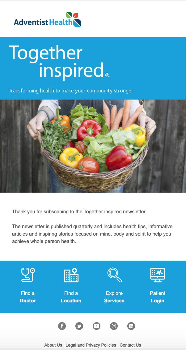
Here’s an example of a welcome email I got from Adventist Health after subscribing to their newsletter.
Why the Email Works
The first scroll stopper in this email is the newsletter name, “Together Inspired.” A unique name gives an identity to the newsletter. This name makes the newsletter recognizable and fosters community among readers like me.
The welcome email also does a great job of telling me about the content to expect and its frequency. This transparency helps subscribers to manage expectations.
Including links to helpful resources on the website encourages subscribers to take further action.
What I like: The simplicity of this welcome email is fantastic. The fruit basket image helps grab attention and adds a pleasant touch to the design.
Also, the copy is short and straightforward, and the calls-to-action (CTAs) are not screaming “buy now.”
2. New Customer Coupon Email
Your new email subscribers will want a good deal. To provide that, you can offer sales discounts like coupons. Whether running a practice or selling healthcare products, offering a coupon can help you win a skeptical customer.
Everlywell is one healthcare brand that milks this sales tactic to grow its revenue.

Why the Email Works
Giving subscribers a discount doesn’t mean they’ll bite — you need to clarify the benefit they’ll get. Everlywell does this effectively. The headline, sub-headline, and content are all geared towards one action: getting subscribers to save 20%.
Also, Everlywell uses bullets to break down large chunks of text. This makes the content organized, scannable, and digestible.
I like the CTA copy — “Save 20% now.” Subscribers like me can’t help but save some change by clicking the button and taking one more step towards the sale.
This means the CTA drives immediate action compared to generic ones or offers no benefit, like submit, sign up, and subscribe.
What I like: The email design is catchy. I also love the color combination, diversity in the color of people below the headline, and typography.
3. Educational Content Email
Sharing promotional content in every email can only take you so far. As the author of The Sales Bible, Jeremy Gitomer, says, “People don’t like to be sold to, but they love to buy” after they get value from vendors.
You can provide value by educating your subscribers with relevant health tips and resources. This establishes you as an authority, builds trust, and nurtures your subscribers until they are ready to buy. Parsley Health excels at this.

Why the Email Works
The subject line — “3 tips for better gut health” — is captivating and aligns with email marketing best practices. Research shows email subject lines with numbers have 57% better open rates. Why? Numbers create curiosity and suggest what an email contains. Also, using the same title as the headline reinforces the message and encourages further reading.
I also like the short and well-structured copy, which has relatable images breaking up the text. This makes it easy for subscribers to read and digest the information. Adding multiple CTAs to relevant resources is an effective way to increase brand awareness and build trust.
What I like: I like how the tips and their corresponding images alternate in the grid layout. This makes the email design visually appealing.
4. Product Email
Product emails primed to convert are concise, have an impressive design and CTA, and use compelling language to highlight features and benefits. They may also include visuals. Let’s look at this fantastic example from Wisp.

Why the Email Works
Wisp’s subject line (“Kiss BV goodbye”) can produce a high open rate because it speaks to a specific pain point — treating bacterial vaginosis. This email also uses the PAS (problem, agitate, solution) copywriting framework well.
- You’ll wait 26 days — problem
- That’s way too long — agitate
- Get relief in 3 hours — solution
Notice the numbers in the email? They add specificity to the problem and solution, making Wisp’s claims quantifiable. Including social proof like the testimonial also helps Wisp establish credibility and boost conversions.
What I like: The email design has an appealing color combination. The copy also says much in a few words that could compel subscribers to make a buying decision.
5. Promotional Email
The goal of promotional emails is simple: persuade subscribers to buy. You do this by leveraging targeted messaging, discounts, limited-time offers, and compelling CTAs. Here’s another excellent example from Everlywell.

Why the Email Works
The subject line — last chance to save 15% — employs the FOMO (fear of missing out) tactic to create a sense of urgency and prompt subscribers to open the email.
Telling subscribers exactly what they’ll save (15%) can also pique their curiosity, resulting in a higher email open rate. The cherry on top is when subscribers read the email and find they can save up to 56% on different Everlywell products.
The email copy is short and fluff-free. It also includes two CTA buttons: Shop now and Join now, making it easy for readers to take the next step.
What I like: The images and colors used in Everlywell’s email design make it visually appealing. Also, the 15% and 56% off on both images are hard to miss and make the goal of the email clear.
6. Webinar Invite Email
Hosting webinars effectively increases brand awareness, establishes authority, and builds credibility. Webinar invite emails typically include the topic, date, time, and registration instructions. They aim to convey the value of attending and encourage participation. Look at this example from Headspace.

Why the Email Works
Headspace personalizes the email immediately by addressing the reader by their full name. Personalization creates a connection with the recipient, making them more likely to engage with the email content.
Also, the language in the email is a fine attempt to connect with subscribers emotionally. Using multiple contrasting CTAs also primes readers to focus on the goal of saving their spot.
What I like: Blending a yellow background with a smiling sun icon is brilliant. Yellow color conveys a sense of warmth, positivity, happiness, and optimism, which ties in with the content of the email.
7. Appointment Confirmation Email
Once clients book an appointment with your practice, they expect to receive a confirmation email. Here’s an example from Pearle Vision:

Why the Email Works
This email is brilliant because it begins with personalization by mentioning the recipient’s name. This captures the reader’s attention and encourages them to learn more about the email.
The email includes essential information, such as the appointment’s date, time, and location. Including the directions button is a pleasant touch that makes it easy for the reader to find the area in one click.
Also, the CTA is clear and compelling to get prospects to confirm their appointment. There’s also an option for clients to reschedule if they can’t show up. This is great for people who could get busy, especially at the last minute.
What I like: The email is laid-back and gently reminds subscribers to confirm their appointment. I also like how Pearle Vision uses the P.S. section to encourage readers to receive appointment reminders via text.
8. Preventive Care Reminder Email
Sending email reminders about regular check-ups, tests, or vaccinations is a great way to show you care about the health of your subscribers. This helps to build trust, strengthen relationships, and encourage referrals.
Let’s look at this example from One Medical, which is encouraging its patients to get their flu shots.

Why the Email Works
The headline, “Don’t miss out. Get your flu shot.” grabs the reader’s attention and creates a sense of urgency.
The email content also does a great job of answering questions about why they need to get the flu shot. This helps to overcome any objections readers may have.
The contextual CTA (Want more? Get the facts) is also relevant, actionable, and compelling for subscribers to take action.
What I like: Interchanging the position of the content and icons in a grid layout makes the email design engaging. The images of the people also tell a story.
For example, as a married person, I can relate to the images of the men and women at the opposite ends because I wouldn’t want my partner to get the flu.
9. Survey Email
Healthcare companies, medical researchers, and wellness programs can use survey emails to assess the effectiveness of services, understand patient satisfaction, or collect data for health-related studies.
Here’s an example of a survey email from Ritual.

Why the Email Works
The subject line — A couple of questions for you — is curiosity-driven, which can increase open rates. I also like the brief email copy, which states what’s expected of the reader and the survey length.
The color of the CTA button reading “Take the survey” contrasts with the rest of the page, making it hard to miss.
In addition, including a name at the bottom of an email adds a personal touch and reinforces the idea that a natural person is behind the communication.
What I like: I like Ritual’s clean, minimalist email design. Nothing fancy.
10. Milestone Email
Companies send milestone emails to celebrate and acknowledge significant achievements or events. These emails recognize and appreciate the recipient’s accomplishments and mark significant anniversaries.
Here’s an example of a birthday email from Alpha Chiropractic.

Why the Email Works
The email starts with a personalized greeting (“Hi Julie”), which shows it’s tailored to the recipient. This helps to establish a connection and make the content feel relevant and meaningful.
Also, the email uses positive language throughout, wishing her good luck, health, and happiness. Though subtle, the email encourages future visits to Alpha Chiropractic. How?
It mentions the brand’s desire to continue helping Julie achieve her wellness goals.
What I like: The email is simple. No special birthday discount or sales pitch. Just a friendly and sincere birthday message enough to put a smile on the recipient’s face.
11. Thank You Email
How do you express appreciation and gratitude to your subscribers for a specific action they took? Simple! By sending a thank you email. It may seem little, but it goes a long way in endearing people to your brand.
Look at this example from Tebra.
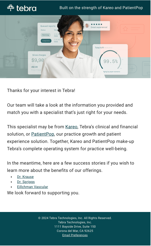
Why the Email Works
After I applied to see a specialist on the website, Tebra sent a nice thank-you message to confirm my interest. This established a positive first impression and ensured I look forward to being matched with a specialist.
The email also contains links to success stories — an excellent opportunity to learn more about Tebra and enhance trust.
What I like: The image of the lady with a bright smile is attention-grabbing and creates a welcoming atmosphere.
12. Order Update Email
After customers purchase a product, sending an order update email is ideal. Besides informing the customer of the order status, this email creates a positive post-purchase experience because of the transparency in the transaction process.
Burst is an example of a healthcare company that sends order update emails to its customers.
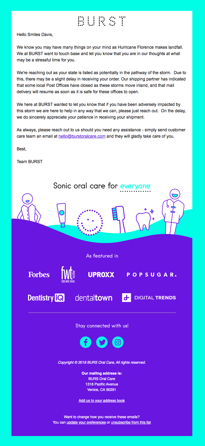
Why the Email Works
Rather than go straight into sharing the order update, Burst empathizes with the customer in the face of a difficult situation. This is a great way to show you care for your customer’s well-being.
The email also contains an “as featured in” section. From experience, adding any form of social proof to your content reinforces credibility and increases customer trust.
What I like: I like the illustrations added to the email content. It’s a cheeky way to show its dental-related content.
13. Informational Email
An informational email is one you send to convey essential details to subscribers. Unlike promotional emails, its primary goal is to share timely and valuable updates, announcements, or news.
Look at this example from the UPMC Health Plan.

Why the Email Works
The first thing people see when they open this email is the headline: “It’s easy and free!” These are power words that grab attention and compel subscribers to read further.
However, excessive use of “free” may lead to your emails being marked as spam.
Also, UPMC’s email is concise and conveys the benefits of getting a flu shot. Adding bullet points helps break up long text, making the content easy to understand.
A curiosity-driven CTA button also stands out and compels users to click.
What I like: The email design is well-structured and visually appealing. There’s enough space between the texts to make the content easy to read.
14. Order Confirmation Email
An order confirmation email is one you send to customers immediately after they complete a purchase on your website or social media page.
This email is a receipt, providing essential information about the order and confirming the transaction details. It’s also an opportunity to cross-sell/upsell other products to your customers.
Check out this order confirmation email from Fullscript.

Why the Email Works
The email starts with an attention-grabbing headline that contains the customer’s name and words of appreciation. Fullscript also includes a “Think you’ll order this again?” section to encourage repeat sales.
What I like: Including product images in the customer order confirmation enhances the buying experience. The images also serve as a visual reminder of what the customer can expect to receive, reducing the likelihood of confusion or dissatisfaction.
15. Testimonials Email
Sharing case studies, reviews, and testimonials from satisfied patients helps to build credibility with prospective patients.
These emails leverage the positive experiences of existing customers to build trust, credibility, and confidence in patronizing your services.
Here’s an example of a testimonial email from Tennessee Reproductive Medicine.

Why the Email Works
As I mentioned, giving your email a unique title like “Fertility Insider” makes it easy to identify. The email content contains a patient’s case study about IVF.
Experience has shown me that sharing case studies is super effective in helping leads make informed decisions. The email also contains a testimonial from a satisfied client. Adding testimonials to your emails helps to build trust and credibility with your subscribers.
What I like: I like the images added to the email content, making it more engaging.
The Best Health Care Email Templates
Below are 10 healthcare email templates you can adapt for your brand.
1. Appointment Booking Confirmation
Subject: Your Appointment is Scheduled, [Patient’s First Name]
Hi [Patient’s Name],
Thank you for choosing [Healthcare Practice’s Name].
This is to confirm that we’ve scheduled your appointment. Below are the details:
- Date: [Appointment Date]
- Time: [Appointment Time]
- Location: [Healthcare Practice’s Address]
To reschedule or cancel your appointment, please call [Your Phone Number] or email [Your Email Address]. Please reach out for any inquiries.
We look forward to receiving you.
Warm Regards,
[Sender’s Name] [Designation], [Healthcare Practice’s Name]2. Health Day Awareness
Subject: Time to End Breast Cancer!
Hi [Patient’s Name],
October is Breast Cancer Awareness Month. We dedicate this month to raising awareness about breast cancer, promote early detection, and support those affected.
Join us to create a breast cancer-free world!
Here are four easy ways to get involved.
- Learn the symptoms of breast cancer: Common signs include a lump in the breast, upper chest, or armpit area; inverted nipple; and change in color of the breast. Click here to learn more about breast cancer symptoms.
- Advocate for monthly self-examination: According to the WHO, 90% of early-stage breast cancers are curable, which is why early detection is crucial. Click here to learn how to perform a Breast Self-exam.
- Mammogram or breast screening: According to the CDC, mammograms can detect breast cancers up to three years before women feel them. Ask women you know to speak with their GP about how often they should get a mammogram.
- Recognize that men are affected too. Although rare, men can have breast cancer too.
If you’re affected by breast cancer, our specialists are always here to provide support that works for you. Call [Your Phone Number] or email [Your Email Address] to schedule a consultation.
Together, we can create a breast cancer-free world.
Best Regards,
[Sender’s Name] [Designation], [Healthcare Practice’s Name]3. Appointment Follow-up After No-show
Subject: Is everything okay, [Patient’s First Name]?
Dear [Patient’s Name],
We noticed you missed your scheduled appointment with us on [Date], [Time]. We understand unexpected events happen and hope everything is okay.
Note that missed appointments could mean [risk to patient]. So, we encourage you to reschedule your appointment promptly. To reschedule, email us at [Your Email Address] or call [Your Phone Number].
Also, remember that we reserve your appointment times only for you. When you miss an appointment, it affects our ability to serve other valued clients.
To avoid paying a no-show fee of $[Amount], we request you cancel your appointment 24 hours in advance if, for any reason, you’re unable to show up.
Thank you for your cooperation and understanding.
We look forward to seeing you soon.
Sincerely,
[Sender’s Name] [Designation], [Healthcare Practice’s Name]4. Anniversary Celebration
Subject: [Anniversary Sale] Celebrating 15 Years Together
It’s a big day for us at [Healthcare Practice’s Name].
It’s our 15th anniversary! That’s one and a half decades of helping you and thousands of other patients live healthier and happier lives!
We thank you for the trust you’ve given us over the years. We’re offering you a 15% discount on [select medical services] to express our appreciation.
Click the button to claim the discount.
[CTA Button — I Want My 15% Discount]NB: Anniversary sale lasts till [Expiration Date]. Seize the offer while it lasts.
Sincerely,
The [Healthcare Practice’s Name] Team
5. Webinar Invitation
Subject: A Free Webinar on [Webinar Topic]
Hi [Patient’s Name],
Are you interested in learning how you can [Webinar Topic]?
If so, join us on [Webinar Date] at [Webinar Time] as [Presenter’s Name], [Presenter’s Title] at [Presenter’s Company Name] discusses how you can [Webinar Topic].
You’ll learn:
- [Subtopic 1]
- [Subtopic 2]
- [Subtopic 3]
RSVP today!
[CTA Button or Registration Link]See you there.
[Sender’s Name] [Designation], [Healthcare Practice’s Name]6. Medicine Order Confirmation
Subject: Your order is on its way!
Dear [Patient’s Name],
We received your order and are getting ready to ship it. Check out your order summary.
- Product Details: [Product Name] x [Quantity] @ [Price]
- Total Price: [Total Price]
- Shipping Address: [Shipping Address]
We are currently processing your order and will keep you updated on the status of your shipment. If you have any questions or concerns, please don’t hesitate to contact us.
Thank you for choosing us. We look forward to serving you again in the future.
[Sender’s Name],Team [Healthcare Practice’s Name]
7. Feedback on a Newsletter
Subject: Loving this newsletter?
Hi [Person’s Name]
Thank you for always reading our newsletter. Your interest means a lot to us.
We’d love to have your feedback on your experience so far. This is important for us to meet and exceed your expectations.
If you’ve got any feedback, email us at [Your Email Address].
We hope to hear from you soon.
Sincerely,
[Sender’s Name] [Designation], [Healthcare Practice’s Name]8. Annual Health Check-up
Subject: It’s been a year already
Hi [Patient’s Name],
I hope this email finds you well.
It’s been a year since your last check-up. Regular checks help you catch health threats early and increase your chance of effective treatment.
Please schedule your annual check-up as soon as possible.
Email us at [Your Email Address] or call [Your Phone Number] to schedule.
We look forward to seeing you soon.
Sincerely,
[Sender’s Name] [Designation], [Healthcare Practice’s Name]9. Birthday
Subject: It’s your SPECIAL Day 🎂 🎉
Here’s our prescription for you today:
A healthy dose of happiness, an extra dose of love, and a big scoop of all the things that make you feel fantastic.
And yes, you have our permission to go heavy on the cake (for today only!).
Happy birthday, [Patient’s Name]!
From all of us at [Healthcare Practice’s Name]
10. Offer Help for Insurance
Subject: Need financial help?
Dear [Patient’s Name],
Please note that we offer medical loans if you need financial help.
To check eligibility and apply, click the button below.
[CTA Button – Apply for Medical Loan]Upon completing your application, our medical counselor will discuss the available options and provide the information you need.
That’s it!
Click the button below to begin your application.
If you have questions, call us at [Phone Number].
Best wishes,
[Sender’s Name] [Designation], [Healthcare Practice’s Name]Sending Emails to Healthcare
Now that you’re equipped with the best healthcare emails and templates, the next step is to start sending. But before you do, always remember you’re dealing with people. Keep your emails personalized and people-first.
![]()
Diving Deep Into Technical SEO for Ecommerce (My Takeaways)

As of 2023, there are over 26.5 million ecommerce websites around the world. Talk about a competitive industry.
As of 2023, there are over 26.5 million ecommerce websites around the world. Talk about a competitive industry.
It’s hard not to be intimidated by the sheer number of ecommerce sites shoppers have to choose from, especially since I’m in the process of launching my own ecommerce business — a vintage home goods store.
The home goods industry is certainly a crowded space, so I know how important it is to get my site’s technical SEO right if I want a chance at showing up in search results to get in front of shoppers.
![Download 10 Excel Templates for Marketers [Free Kit]](https://no-cache.hubspot.com/cta/default/53/9ff7a4fe-5293-496c-acca-566bc6e73f42.png)
To make sure I get my SEO right, I spoke to a few experts to find out which technical SEO elements my ecommerce site must have. Below, I’ll also walk through some examples of websites that get technical SEO right. Let’s dive in.
Table of Contents
- Getting Technical SEO Right in Ecommerce
- Ecommerce Sites That Get Technical SEO Right
- What I Learned About Technical SEO
Getting Technical SEO Right in Ecommerce
There are several technical SEO elements needed for an ecommerce business to thrive. These are the steps to follow if you want to get it right, according to a couple of ecommerce experts I talked to.
Set up site architecture.
The way your site is set up in the back end is just as important as how it looks to shoppers. This means your pages should have a clear structure and be easy for shoppers to navigate.
Successful website architecture begins with creating a user-friendly navigation menu and limiting the number of pages visitors have to click through to get the information they need.
Here’s an example of a simple and clear website architecture.
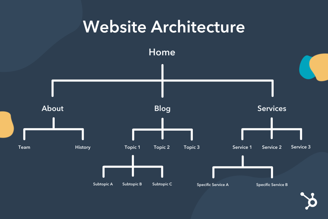
“Pages should have a clear structure,” suggests James Taylor, SEO strategist at Embryo. “Reduce the amount of clicks required between the home page and checkout.”
In the case of an ecommerce website, your page structure should make it quick and easy for people to browse and purchase your products.
“Not only is clear site structure important for user experience,” adds Taylor, “but the structure of a website can also influence the success of how a search engine crawls and ultimately indexes your site.”
Pro tip: If you want to improve your chances of showing up in the SERP for a product your customer is shopping for, then Google has to know that your products exist. Keep this in mind when naming and organizing your ecommerce web pages.
Use structured data.
It’s also essential to include structured data in your site’s product pages. Structured data is a set of data that is organized and tagged with specific groups of text that help search engines understand the context of the information so they can present accurate results to searchers. This data is also referred to as schema markup.
In the context of ecommerce websites, structured data lets search engines know that your product pages are, in fact, products that people can purchase (versus informational pages like blog posts, for instance).
“Ecommerce sites typically include a lot of information,” explains Simon Hughes, founder and creative director of Design & Build Co. “If you don’t make [your site’s data] clear to Google, it can easily be misinterpreted and dramatically affect how you appear in search results.”
Pro tip: Schema markups can also improve the CTR (click-through rate) of your page in the SERP as they organize your product page’s data in a more appealing way to users by presenting them with information they’d want to know right away when shopping.
Here’s an example of a schema markup in action. This product listing for ballet flats from the shoe brand Sam Edelman includes the brand’s average rating and number of customer reviews, as well as its delivery timeline and return policy.
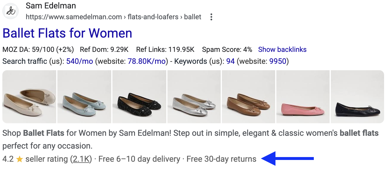
Hughes adds, “By providing structured data in schema markups, you should be able to get additional information about your products visible to shoppers directly on the search results page.”
Helpful information you may want to highlight in your product markup includes:
- Reviews.
- Price.
- Delivery window.
- Return policy.
Consider what information can help your product stand out in the SERP.
What can help shoppers with their decision-making process? For instance, if you offer free shipping or free returns, this can be a benefit worth highlighting in your product markup as it will be one of the first things shoppers see.
Conduct keyword research.
Technical SEO isn’t just for the backend of your website — it can also support the front end. Conduct keyword research so you can incorporate target keywords into your on-page content as well as the backend.
“Knowing what people search for when purchasing the products you sell can help you write relevant content for product pages and categories,” says Taylor. “These focus keywords should then also be included within the meta title and description, alt tag, and product pages.”
The content on your site should not only be informative and useful to the visitors but should be tailored to search engines by letting them know what your ecommerce business offers and how trustworthy your site is.
Pro tip: All of your products should also have a unique title and specific description, which Taylor notes is “not a quick process, but [is] crucial to increase visibility.”
Refine your technical SEO.
Behind the scenes, there are a few more details that need to be refined to deliver a robust ecommerce SEO strategy.
These are the additional elements to optimize, according to Taylor:
- Site speed. A slow website will increase bounce rate. Studies have shown that time on site impacts your search ranking, so it’s important to optimize your site speed.
- Image quality. Large, high-resolution images can slow down your website. To improve your website speed, optimize your photos and graphics to be a smaller file size without compromising the resolution or appearance of the image.
- Indexation. Also part of the site architecture, indexation will improve the search engine’s process when crawling your website. Indexation also helps the end user. Clear structure, internal linking, sitemap, and blocking pages that aren’t relevant all make it easier to navigate your website.
- Mobile first. Most users access websites using their phones. In fact, 50% of shoppers aged 30-49 shop on their smartphones at least once a week. Ecommerce sites should be dynamic and optimized for mobile before desktop.
Optimize your site for Google Shopping.
The final step of executing technical SEO for your ecommerce website is to submit your product data to Google Merchant Center, recommends Hughes.
“While this isn’t necessary to appear in search results,” he says, “it can further help Google understand your products, and it also makes you eligible to appear in the Google Shopping tab.”
Pro tip: You’ll also need to complete this step if you plan to run Google Ads for your products, so it’s a good idea to set this up while you’re working on your site’s SEO.
Ecommerce Sites That Get Technical SEO Right
Keeping these expert tips in mind, I wanted to find a couple of ecommerce websites that execute technical SEO well so I could use them as inspiration for my own site. Here are some examples I found and what they get right.
Wayfair
Wayfair is the first ecommerce website that comes to my mind when I think about technical SEO. The home goods site has millions of products that must be organized, discoverable, and optimized for search. That’s some heavy lifting.
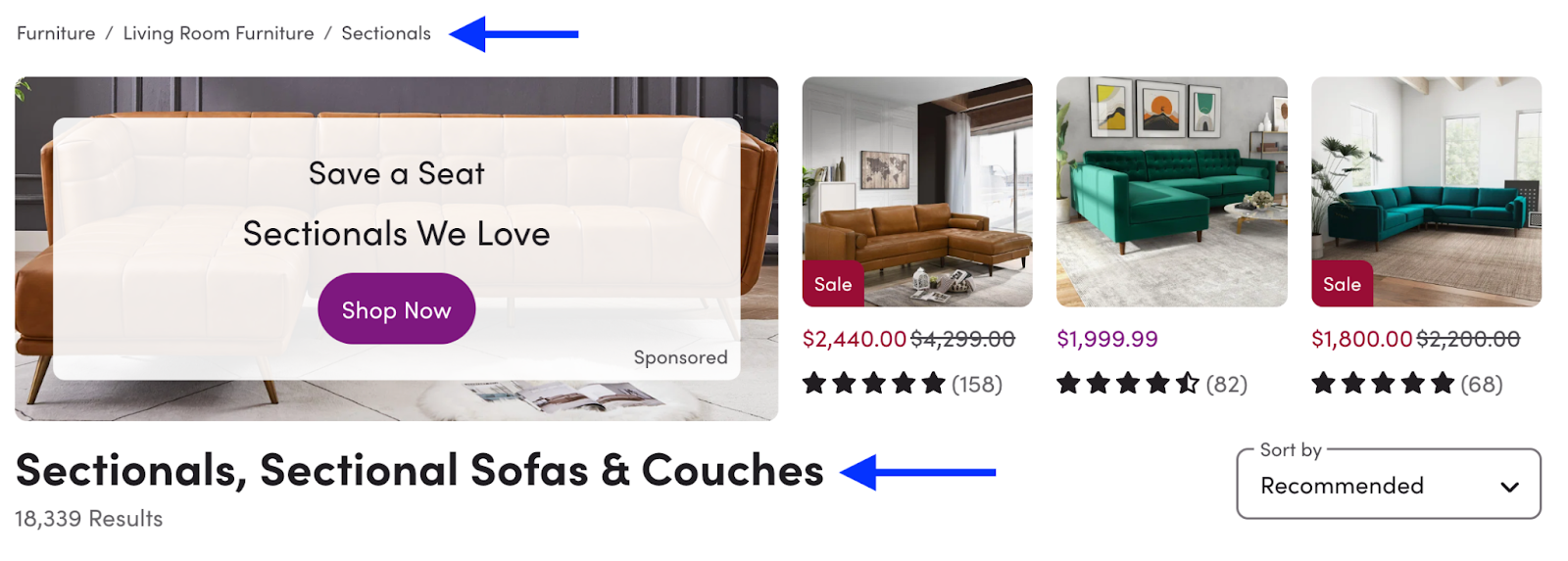
When I visited Wayfair’s site, the first thing I noticed was the navigation menu. Every product is organized into user-friendly categories at the top of the page. Not only is this easy to navigate as a shopper, but this is also a great example of site architecture.
Search engines can quickly understand how to index Wayfair’s website due to its clear structure.
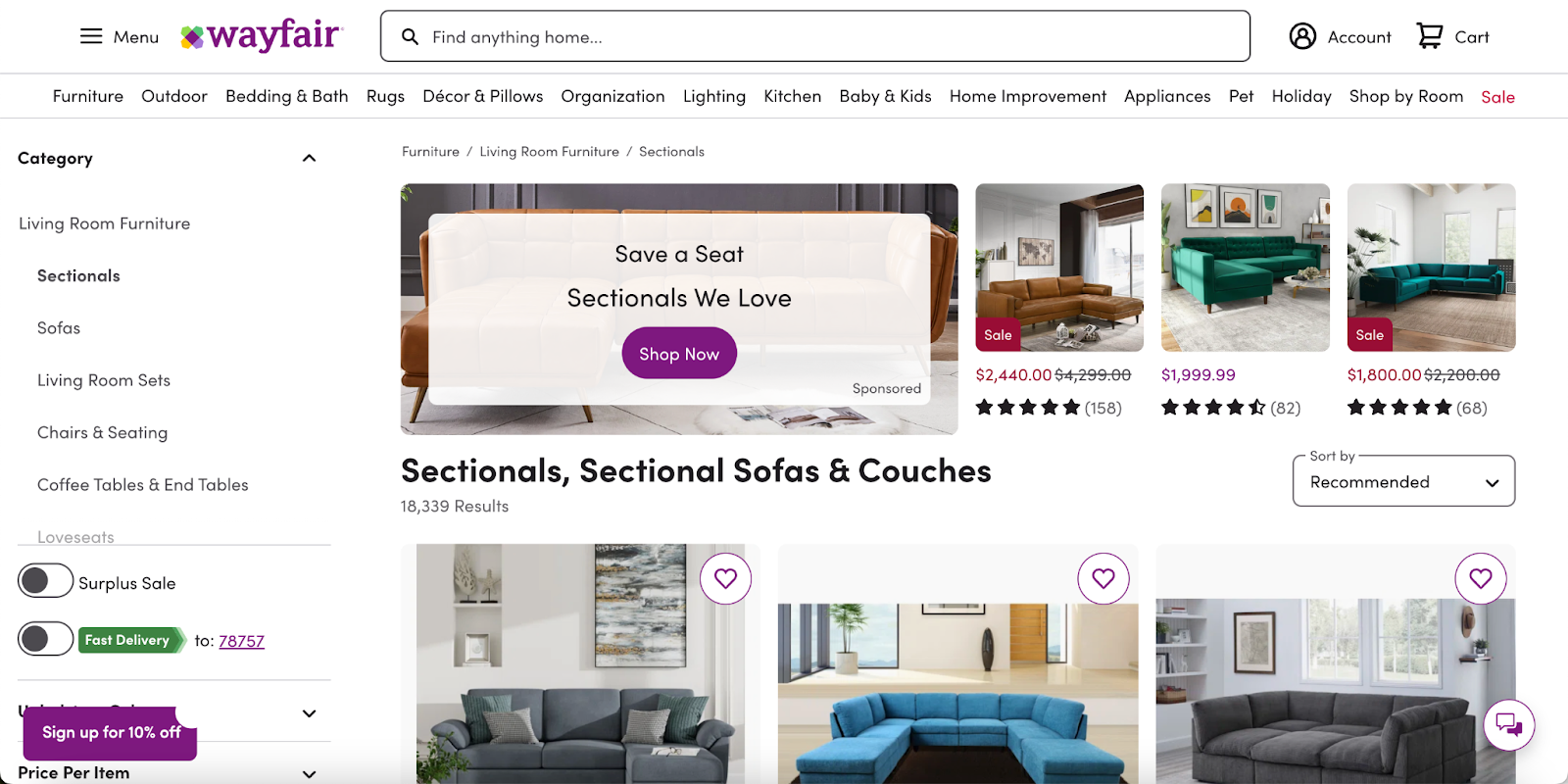
The next thing I notice is how each product section is optimized. For example, when I navigated to the “furniture” tab, I was taken to a drop-down menu of sub-categories to choose from based on the room I’m shopping for.
I went with the Living Room Furniture category. Once there, I navigated to the Sectionals category. I immediately noticed that not only was the page architecture very easy to follow, but the product page listed target keywords as the page title.
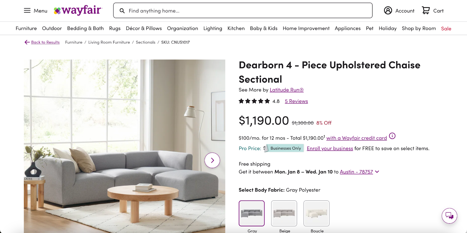
I selected one of the sofas listed to see how Wayfair incorporated technical SEO on an individual product page.
As I suspected, the product page is optimized for both the shopper and search engines. The product’s page title includes the sofa’s brand name as well as a descriptive keyword. There are also relevant keywords used throughout the product description.
Finally, I was curious what the search results for this product category looked like, so I searched for “reversible sectional” and saw this result from Wayfair:
This result aligns with one of the tips I shared above, which is to use schema markups to provide more information in the SERP.
What we like: Wayfair clearly follows technical SEO best practices to optimize its ecommerce website for shoppers and search engines.
Sam Edelman
I wanted to take a look at how an ecommerce website in a different shopping category executes technical SEO, so I checked out Sam Edelman.
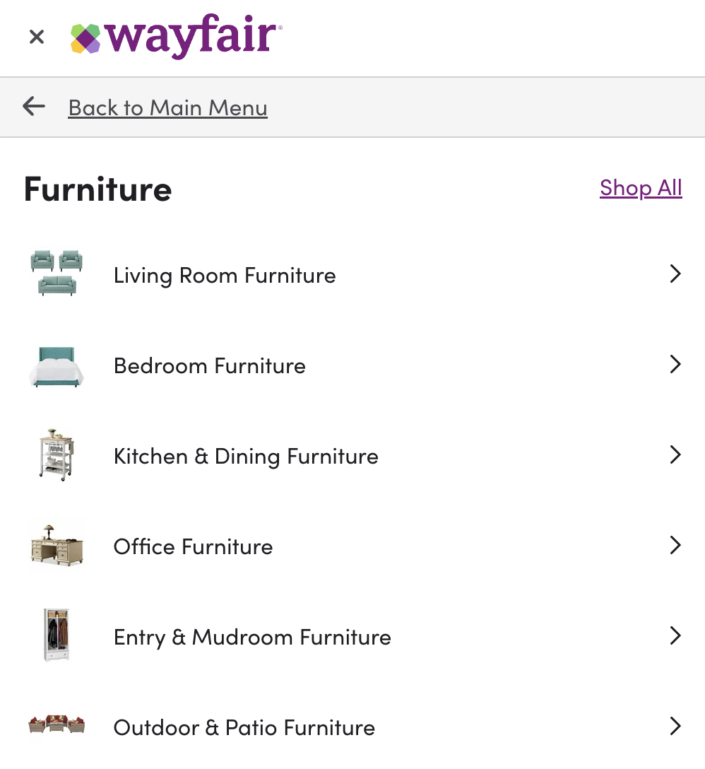
Like many shoe brands, Sam Edelman offers a variety of shoe styles. To make it easy for shoppers to find what they’re looking for, the website offers user-friendly navigation:
I navigated to the Flats & Loafers category and was greeted with another optimized page.
There are several sub-categories within the flats and loafers style, and Sam Edelman displays them at the top for easy navigation. These categories can also help search engines better understand the brand’s website offerings.

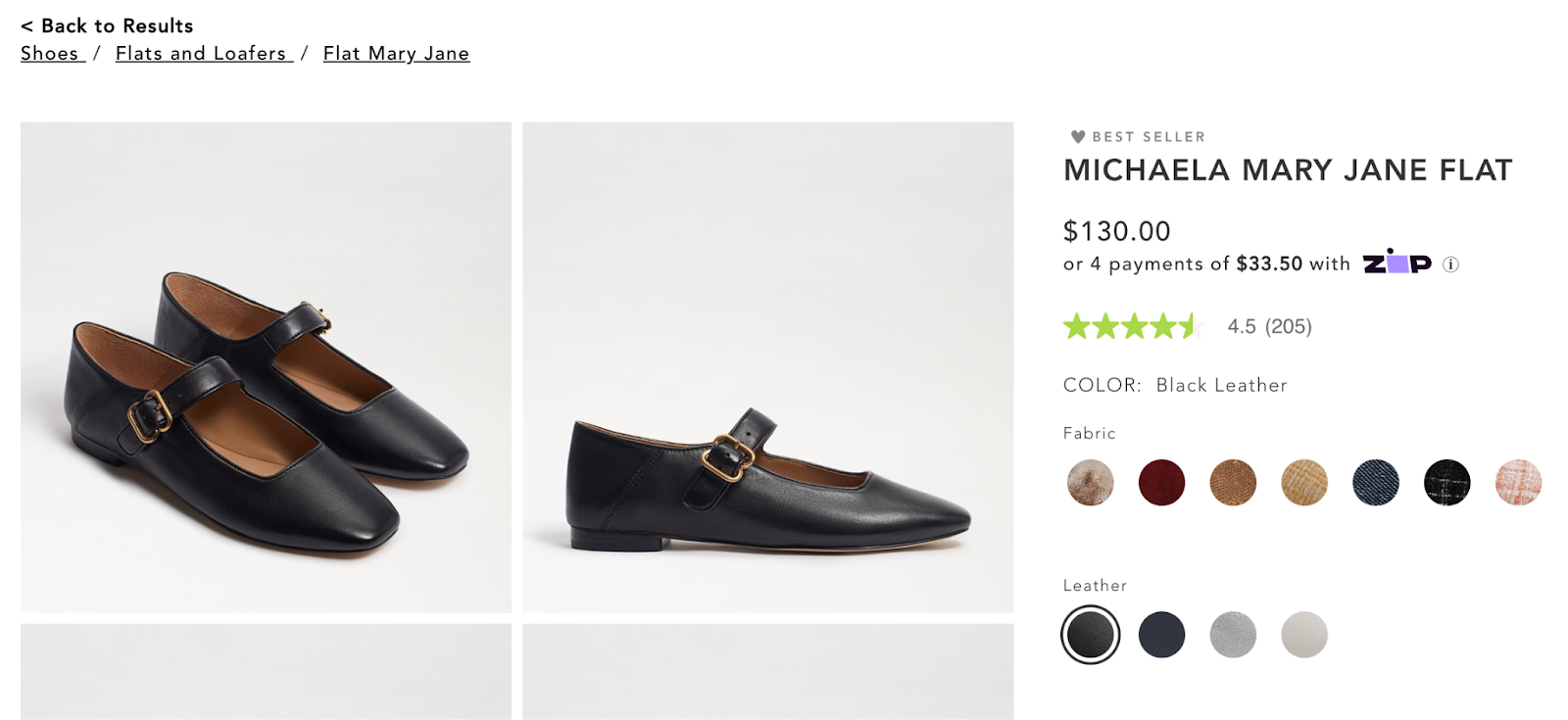
I selected one of the brand’s best-sellers to see how the individual product pages are optimized. Mary Jane flats are a popular shoe style right now, so it makes sense to include the phrase “Mary Jane” in the product title.
As I did with Wayfair, I also ran a search for one of the keywords I found on Sam Edelman’s website, “Mary Jane flats.”
Here’s how the search result shows up:
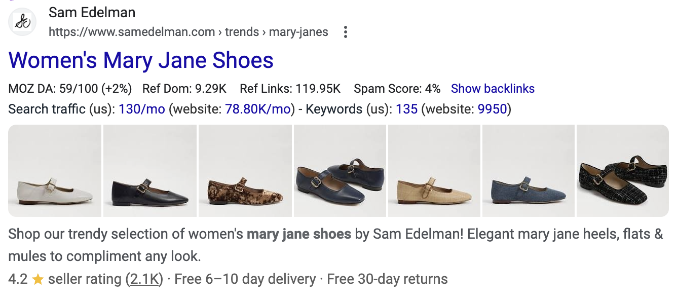
What we like: Not only are all of the relevant products organized under one page (which makes it easy for Google to index), but the search listing also includes a schema markup with important information for decision-makers.
What I Learned About Technical SEO for Ecommerce
As I embark on my journey of launching an ecommerce website, I now have a deeper understanding of why technical SEO is so crucial — and how I can use it as a tool to help my website stand out.
My biggest takeaway is that the website structure is a major determining factor in whether or not Google understands what you do. To help search engines understand that I sell products, it helps to create a simple navigation menu with categories and sub-categories.
Clear navigation also makes it easy for users to find what they’re looking for. And if there’s one thing I want to guarantee for my ecommerce website, it’s that my future customers have a seamless experience. I want to make sure it’s easy for them to discover my ecommerce site, explore my products, and shop seamlessly.
Technical SEO can give your ecommerce business a leg up. When you understand how to appease both shoppers and search engines, you increase your chances of making sales — and that’s the end goal, after all.
![]()
How to Create Excel Charts and Graphs
Excel charts and graphs are tried-and-true tools for visualizing data clearly and understandably. But for those who are not native tech gurus, it can be a bit intimidating to poke around in Microsoft Excel.
Excel charts and graphs are tried-and-true tools for visualizing data clearly and understandably. But for those who are not native tech gurus, it can be a bit intimidating to poke around in Microsoft Excel.
I’m here to share the foundational information you need, helpful video tutorials, and step-by-step instructions for anyone feeling like they are in over their heads.
Organizing a spreadsheet full of data into an accurate and attractive chart isn’t sorcery — you can do it! Let’s go over the process from A to Z.
What an Excel Chart or Graph is — and Why to Use Them
The first thing to know is that you can create different types of charts and graphs in the software.
The unique information in your data set(s) and the audience you are communicating to are factors that go into choosing the appropriate chart or graph for your project, so let’s chat charts.
But why use them? Do you need to visualize data when you can just explain it? The answer is typically yes if you want to help an audience understand and retain the relevant findings.
I’ll never forget a particular graph from a TED talk I saw on parenting taboos — and I’ve never seen anything play out so accurately in my own life, either:
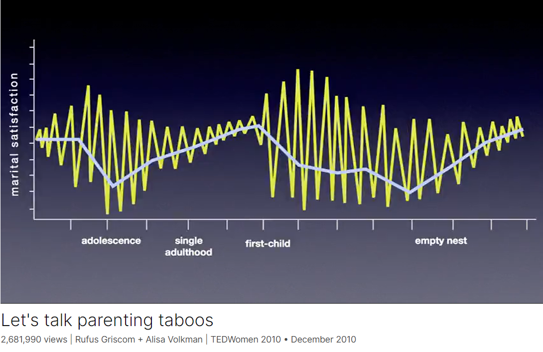
This chart from Rufus Griscom + Alisa Volkman shows a mean line of happiness in blue and more of a moment-by-moment breakdown in yellow of the data points that build the mean you see.
The highs and lows tend to be less erratic during single adulthood because you have more control over your environment and circumstances, they explain, but once you have kids? Chaos.
They joked about Grand, explosive moments of love accompanied by mind-numbing, soul-punching lows — usually around bedtime routines. (It’s no joke.)
From this, we can glean that it’s always a good idea to distill the information into something visually digestible so you can communicate clearly and efficiently.
The last thing you want is to lose your target’s attention in a sea of incomprehensible numbers.
Especially for large data sets, an Excel chart or graph gets to the heart of your findings in a way that is easy to see and understand at a single glance, especially when you incorporate comparisons.
If your data has more than one finding to communicate — such as a comparison or if you want to illustrate changes taking place over time — Excel charts and graphs offer several options for creating impactful visuals.
By the end, you’ll have some ideas about which charts could help you tell the stories contained within your data.
The 18 Types of Charts in Excel (So Far)
Whew, Microsoft has been busy! Last I did a deep dive, there were only nine types of charts, so it has doubled in the previous few years — which is excellent news for research communicators.
When you understand their uses, you can present material optimized to be highly valuable and insightful for your team’s projects.
We’ll go over the best, tried-and-true options thoroughly. Then, at the end, I’ll briefly summarize the advanced chart types and those that may not be as useful to marketers.
Excel Charts Most Useful to Marketers
1. Area Chart
Excel area charts allow you to see trends over time — or some other relevant variable. It’s essentially a line graph with colored-in sections emphasizing progression and giving a sense of volume.
You can also use stacked area charts. This denser area chart allows you to show more information at once, such as comparing trends in multiple categories or tracking changes across different variables.
Best for: Demonstrating the magnitude of a trend between two or more values over a given period.
2. The New and Improved Bar Graph (Now Called a Clustered Bar Graph)
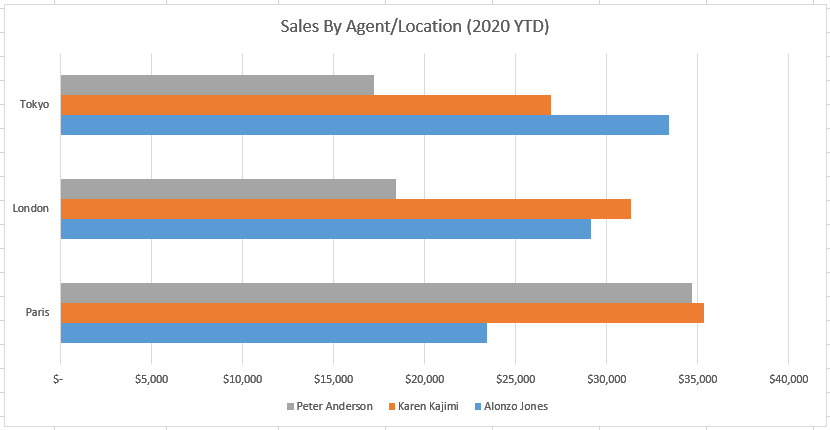
An Excel bar graph represents information horizontally and compares different data series. You can easily see the proportions between various categories or elements of your data.
For instance, you can use clustered bar graphs to compare the sales of different products, for example, in other store locations over months or quarters.
This can help you understand which products sell well in different geographies during the same time frame.
Best for: Comparing the frequency of similar values between different variables.
3. Ditto for Column Charts (Renamed Clustered Column Charts)
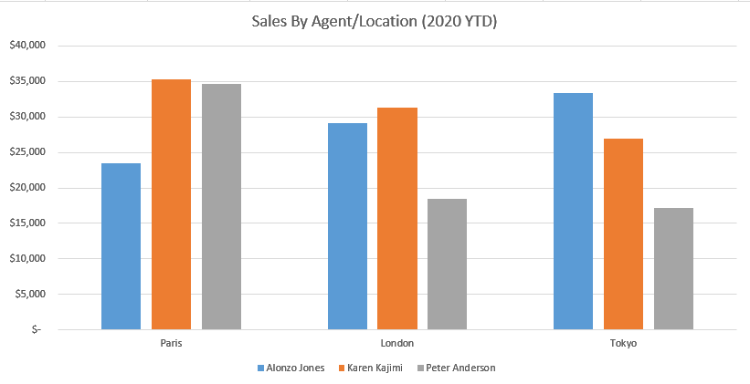
Column charts are similar to bar graphs, but they differ in one critical way: they’re vertical, not horizontal. The vertical orientation lends itself to helping viewers rank different data elements.
Like bar graphs, column charts compare data, display trends, and show proportions.
For instance, if you want to rank your sales teams’ numbers in different states across a quarter, you can visualize them in a clustered column chart and see which team in each state is in the lead — the tallest in the cluster.
You can also see which team is leading among all states — the tallest among all clusters.
Best for: Displaying various data elements over some time to rank them visually.
Pro tip: I’ve personally learned that column charts displaying T-bars of statistical significance are extremely useful in helping people in leadership dispel likely but ultimately untrue interpretations of data.
Sometimes, data showing meaningful change is still within normal parameters. Sometimes, what seems like a slight difference is significant.
Managers and directors may need help seeing these realities so they don’t oversteer at decision time.
4. Line Graph

A line graph is a simple but highly effective way to see trends over time at a glance — even without the frills of bars, columns, or extra shading. You can also compare multiple data series.
For instance, the number of organic visits from Google versus Bing over a 12-month period.
You can also see the rate or speed at which the data set changes. In our Google vs. Bing example, a steep incline would mean you had a sudden spike in organic traffic. A more gradual decline means that your traffic is slowly decreasing.
Best for: Illustrating trends over time, such as spikes or drops in sales due to holidays, weather, or other variables.
5. Pie Chart

A pie chart is a helpful way of seeing how different data elements proportionally compare to one another. Curious what percentage of your organic traffic is from Google versus Bing?
Or how much market share do you have compared to competitors? A pie chart is a fitting way to visualize that information.
It’s also a great way to see and communicate progress toward a specific goal.
For instance, if your goal is to sell a product every day for 30 days in a row, then you might create a pie chart with 30 slices and shade a slice each day you sell the product.
Best for: Showing values as percentages of a whole and viewing data elements proportionately.
6. Radar Chart
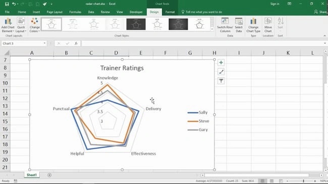
A radar chart might look familiar to you if you’ve ever taken a personality test, but it’s also useful outside of that industry. Radar charts display data in a closed, multi-pointed shape.
Each point is called a spoke, and multiple variables “pull” spokes of the shape. Then, shapes can be stacked up for comparison.
This type of chart is well-designed for comparing different data elements, such as attributes, entities, people, strengths, or weaknesses. It also helps you see the distribution of your data and understand if it’s overly skewed one way or another.
Best for: Comparing the aggregate values of multiple data series at once.
7. Scatter Plot
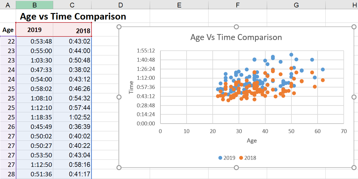
Scatter plots look similar to line graphs but with one critical difference: They evaluate the relationship between two variables, shown on the X- and Y-axes. This enables you to identify correlations and patterns between them.
For instance, you might compare the amount of organic traffic (X-axis) with the number of leads and signups (Y-axis).
If you see an upward trend in the dots where these two converge, then you’ll have an idea of how an increase in organic traffic affects your leads and signups.
If you have a leads/signups goal, you can then create a more data-driven plan for increasing your organic traffic.
You can even take it a step further to compare the number of leads and signups with daily sales or conversions to keep more programs on data-driven paths.
Best for: Visualizing positive or negative relationships between two variables.
8. Funnel Chart
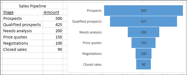
Funnel charts are extremely well-suited to marketers who want to optimize processes and pipelines.
In the image above, it’s clear that you drop the most candidates between Qualified Prospects and Needs Analysis, so that portion of your funnel may be interesting to look into more deeply to understand why.
Best for: Visually representing changes through processes helps to clarify where the biggest changes occur along the way.
Pro tip: My experience has taught me that if you only use two levels — especially if there’s not a great change between them, it’s easy to mistake this for a bar graph, which functions completely differently.
You’ll definitely want to use at least three levels so it’s more clearly distinguished as a funnel shape.
9. Histogram Chart
Histograms are a solid option when you want to explain data that occurs most usefully in ranges. Let’s say that you want to show your clients the buying habits of various age demographics in your product niche.
You may find that your target audience has moved, possibly even jumped a range up or down.
If your client has sold baby products for the last 100 years, you’d definitely see that the target audience of first-time parents is getting older as people wait longer to have children.
This may change your marketing strategies to meet the needs and issues of this older first-time parent demographic.
Best for: Demonstrating data findings that are most noticeable and useful when the data is grouped in ranges.
Advanced Excel Charts
It’s smart for you to know that the following chart types exist, but they may not be the best place to start if you arrived here today a bit overwhelmed.
They are more complicated and better suited to audiences who can already read advanced-level charts:
- Box and whisker chart.
- Pareto chart.
- Surface chart.
- Sunburst chart.
- Treemap chart.
Industry-Specific Excel Charts
The remaining Excel chart types don’t typically lend themselves to marketing. But, hey — if your niche calls for it, these charts are there to support you:
- Stock chart.
- Waterfall chart.
- Filled map chart.
- Combo chart.
Summarizing the Charts
That was a ton of information. If you’re still not sure which to choose, here’s a concise comparison of the Excel charts I find to be most useful to marketers:
|
Type of Chart |
Use |
|
Area |
Area charts demonstrate the magnitude of a trend between two or more values over a given period. |
|
Clustered |
Clustered bar charts compare the frequency of values across different levels or variables. |
|
Clustered |
Clustered column charts display data changes over a period of time to make clear visualizations of rank among data sets. |
|
Line |
Similar to bar charts, they illustrate trends over time. |
|
Pie |
Pie charts show values as percentages of a whole. |
|
Radar |
Radar charts compare the aggregate value of multiple data series. |
|
Scatter |
Scatter charts show the positive or negative relationship between two variables. |
|
Funnel |
Funnel charts excel at visualizing changes to one data point over various processes. |
|
Histogram |
Histograms show variations in data that are best represented as a range of values. |
If you’re looking for a deeper dive to help you figure out which type of chart/graph is best for visualizing your data, check out our free ebook, How to Use Data Visualization to Win Over Your Audience.
How to Create a Graph in Excel
The steps to build a chart or graph in Excel are relatively simple. I encourage you to follow the step-by-step instructions below or download them as PDFs if that’s more efficient for you.
Most of the buttons and functions you’ll see and read are very similar across all versions of Excel.
Download Demo Data | Download Instructions (Mac) | Download Instructions (PC)
Featured Resource: Free Excel Graph Templates
Before we jump in, it’s time for another pro tip. You need not start from scratch. You are welcome to use these free Excel Graph Generators. Just input your data and adjust as needed for a beautiful data visualization.
It’s a great time-saver if you don’t need something as custom as building your Excel charts and graphs up from zero.
When you do need to create and customize from the very start, here’s how to tackle it:
1. Enter your data into Excel.
First, you need to input your data into Excel. You might have exported the data from elsewhere, like a piece of marketing software or a survey tool — or maybe you’re inputting it manually from spreadsheets. I don’t judge!
In the example below, in Column A, I have a list of responses to the question, “Did inbound marketing demonstrate ROI?” and in Columns B, C, and D, I have the responses to the question, “Does your company have a formal sales-marketing agreement?”
For example, Column C, Row 2 illustrates that 49% of people with a service level agreement (SLA) also say that inbound marketing demonstrated ROI.
2. Choose from the graph and chart options.
In Excel, your options for charts and graphs include column (or bar) graphs, line graphs, pie graphs, scatter plots, and more. See how Excel identifies each one in the top navigation bar, as depicted below:
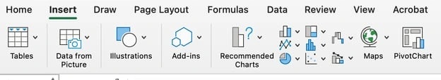
To find the chart and graph options, select Insert.
3. Highlight your data and insert your desired graph into the spreadsheet.
In this example, a bar graph presents the data visually. To make a bar graph, highlight the data and include the titles of the X- and Y-axis. Then, go to the Insert tab and click the column icon in the charts section.
Choose the graph you wish from the dropdown window that appears.
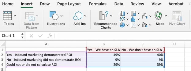
I picked the first two-dimensional column option because I prefer the flat bar graphic over the three-dimensional look. See the resulting bar graph below.
However, if I were reporting statistics about skyscrapers to a builder’s union, I’d definitely pick the three-dimensional look to customize the chart to look like built structures.
There are optimization choices to make along the way to best fit your data and audience.
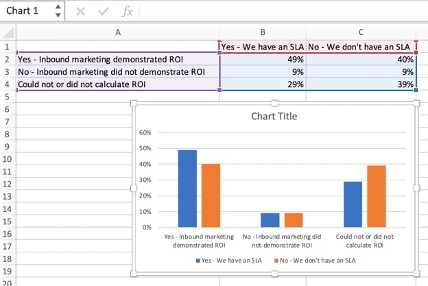
4. Switch the data on each axis, if necessary.
If you want to switch what appears on the X and Y axis, right-click on the bar graph, click Select Data, and click Switch Row/Column. This will rearrange which axes carry which pieces of data in the list shown below.
Sometimes, you’ll see that your information just presents better one way versus the other. In this case, I think the first X and Y orientation is easier and simpler to understand.
Keep in mind, though, that it’s not about me.
If the presentation focuses on SLAs and executive decisions on whether or not to secure one, a Yes/No SLA configuration (the second XY orientation) is likely a better fit for the audience and their needs. When finished, click OK at the bottom.
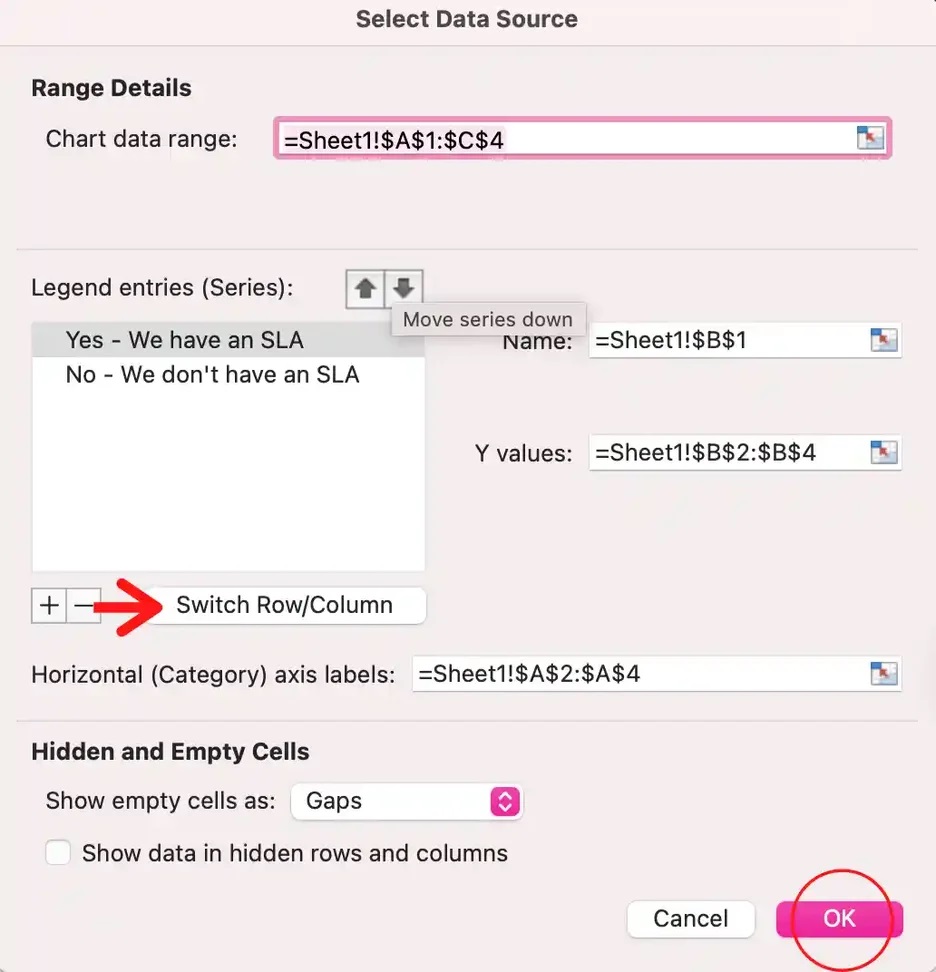
The resulting graph would look like this:
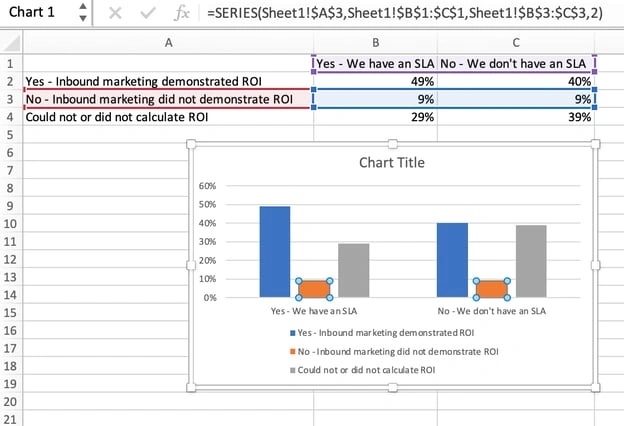
5. Adjust your data’s layout and colors.
To change the labeling layout and legend, click on the bar graph, then click the Chart Design tab. Here, you can choose which layout you prefer for the chart title, axis titles, and legend.
In my example below, I clicked on the option that displayed softer bar colors and legends below the chart.

To further format the legend, click on it to reveal the Format Legend Entry sidebar, as shown below. Here, you can change the fill color of the legend, which will change the color of the columns themselves.
To format other parts of your chart, click on them individually to reveal a corresponding Format window.
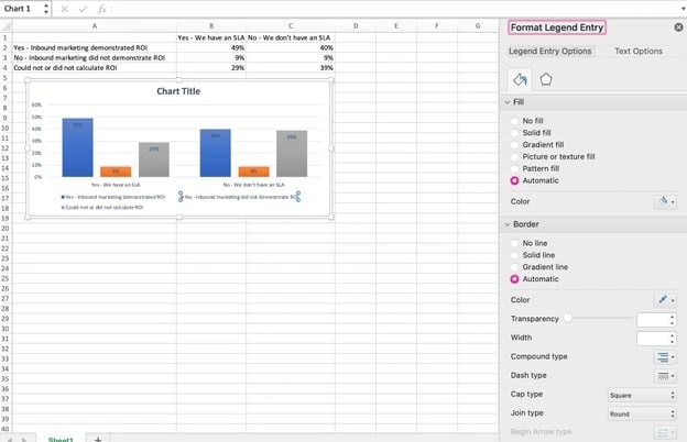
6. Change the size of your chart’s legend and axis labels.
When you first make a graph in Excel, the size of your axis and legend labels might be small, depending on the graph or chart you choose (bar, pie, line, etc.)
Once you‘ve created your chart, you’ll want to size those labels up so they’re legible.
To increase the size of your graph’s labels, click on them individually and, instead of revealing a new Format window, click back into the Home tab in the top navigation bar of Excel.
Then, use the font type and size dropdown fields to expand or shrink your chart’s legend and axis labels to your liking.
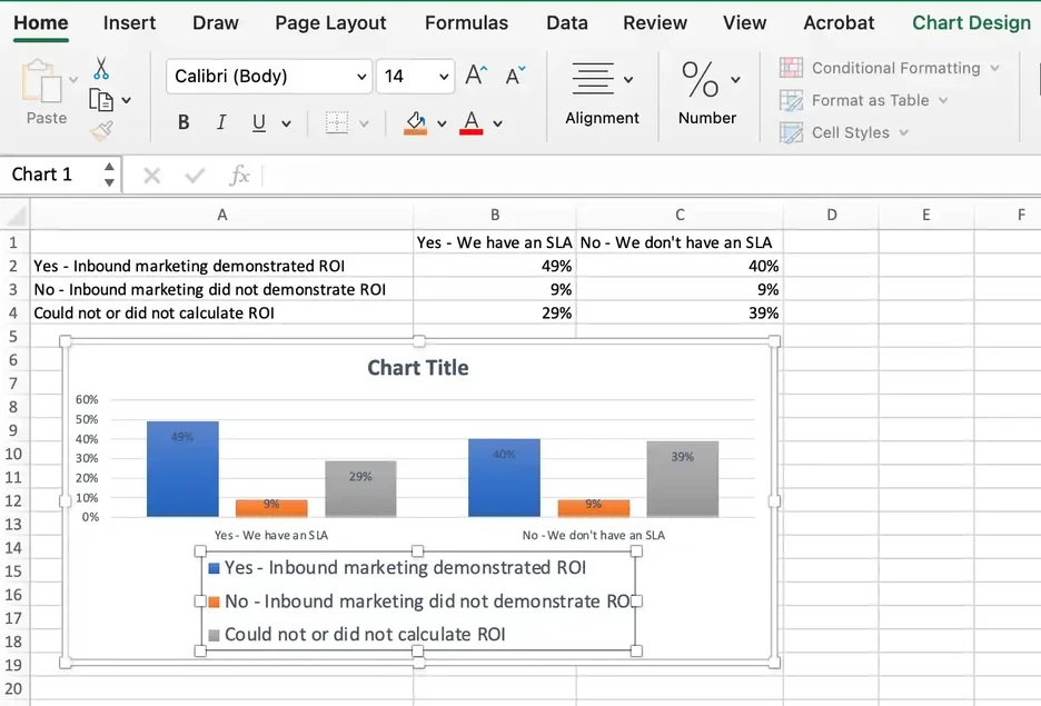
7. Change the Y-axis measurement options if desired
To change the type of measurement shown on the Y-axis, click on the Y-axis percentages in your chart. This reveals the Format Axis window.
Here, you can decide if you want to display units located on the Axis Options tab. You can change whether the Y-axis shows percentages to two decimal places or no decimal places.
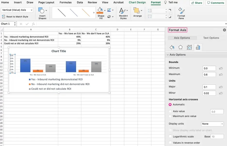
Because my graph automatically sets the Y axis’ maximum percentage to 60%, you might want to change it manually to 100% to represent data on a universal scale.
To do so, you can select the Maximum option — two fields down under Bounds in the Format Axis window — and change the value from 0.6 to one.
The resulting graph will look like the one below (In this example, the font size of the Y-axis has been increased via the Home tab so that you can see the difference):
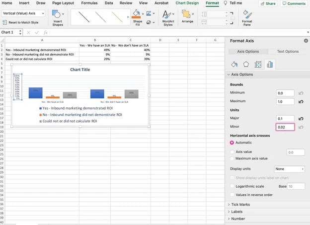
8. Reorder your data, if desired.
To sort the data so the respondents’ answers appear in reverse order, right-click on your graph and click Select Data to reveal the same options window you called up in Step 3 above.
This time, arrow up and down to reverse the order of your data on the chart.
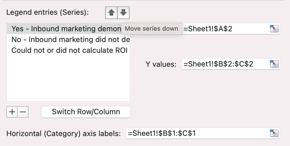
If you have more than two lines of data to adjust, you can also rearrange them in ascending or descending order. To do this, highlight all of your data in the cells above your chart, click Data, and select Sort, as shown below.
Depending on your preference, you can choose to sort based on smallest to largest or vice versa.
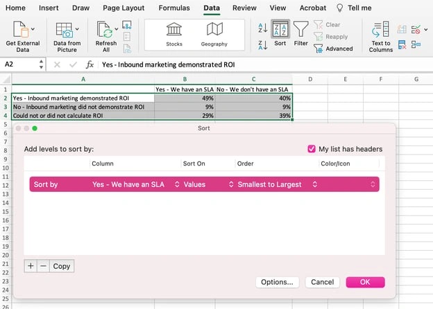
The resulting graph would look like this, which is tremendously better. Why? Because it shows your audience the progression of results and becomes visually persuasive.
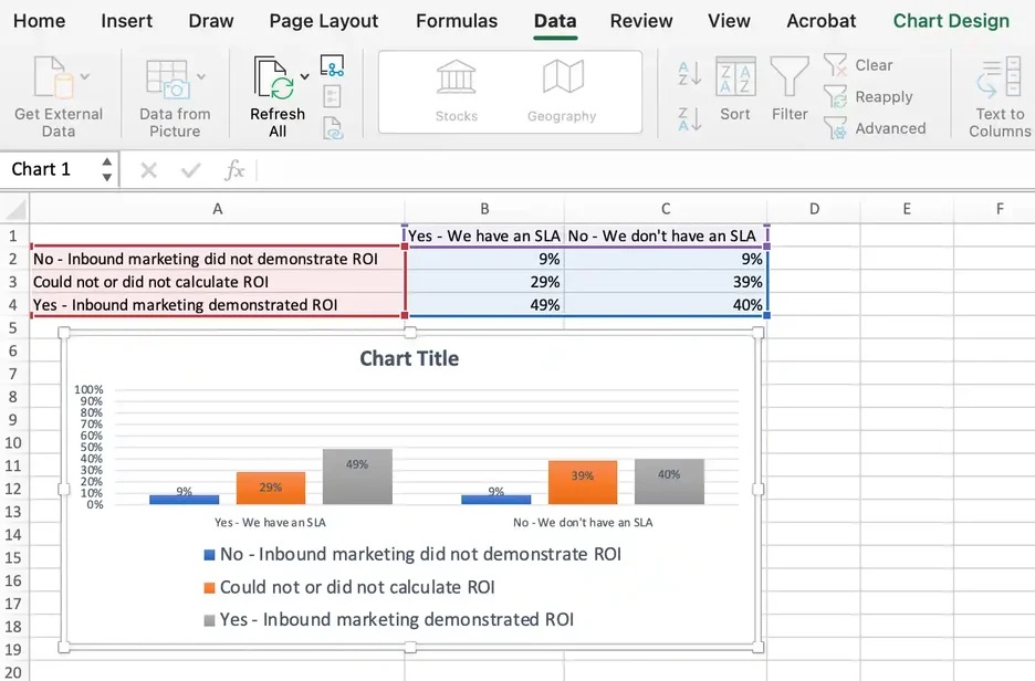
9. Title your graph.
Now comes the fun and easy part: naming your graph. By now, you might have already figured out how to do this. Here’s a simple clarifier.
Right after making your chart, the title that appears will likely be “Chart Title” or something similar, depending on the version of Excel you‘re using. To change this label, click on “Chart Title” to reveal a typing cursor.
You can then freely customize your chart’s title.
When you have a title you like, click Home on the top navigation bar, and use the font formatting options to give your title the emphasis it deserves. See these options and my final graph below:
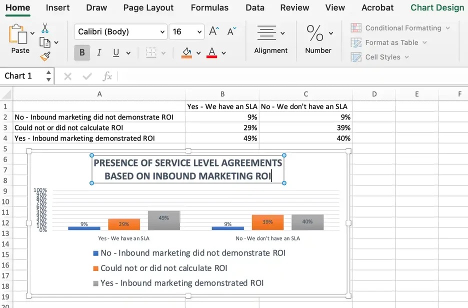
10. Export your graph or chart.
Once your Excel chart or graph is exactly the way you want it, you can save it as an image without screenshotting it in the spreadsheet.
This method will give you a clean image of your chart that can be inserted into a PowerPoint presentation, Canva document, or any other visual template.
To save your Excel graph as a photo, right-click on the graph and select Save as Picture.
In the dialogue box, name the photo of your graph, choose where to save it on your computer, and choose the file type you’d like to save it as. In this example, it’s saved as a JPEG to a desktop folder. Finally, click Save.
You’ll have a clear photo of your graph or chart that you can add to any visual design.
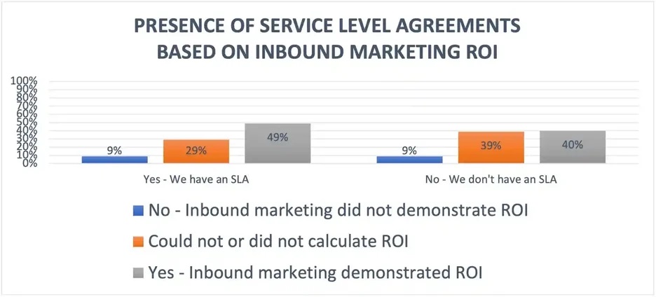
Visualize Data Like A Pro
Ready for one final step to make this whole process faster? You can now swap your data into various graph types — like a pie chart or line graph — to quickly and more easily determine what format best tells the story of your data.
Here’s how you do it:
Step 1. Select the chart.
Look at your Excel chart or graph to find a blank spot within it. Click on a blank spot. Once the chart is highlighted all around the border, you’ll know it’s selected.
Step 2. Right-click or go to the Chart Design tab.
Once the chart is selected, the ribbon above will show a Chart Design tab. You can go click on that or simply right-click your selected chart to save time. Either way, you’ll see various chart options to choose from.
Step 3. Change the chart type.
When the chart options pop up — either on the ribbon or under your cursor if you right-clicked — you’ll next click Change Chart Type. A menu will pop up with a variety of chart type options on the left.
To the right will be a visual example of the chart type you click on.
Step 4. Shop for your chart.
The last bit is the most fun! You can click the Recommended Charts tab or the All Charts tab and start clicking your way down the list of chart types. As you see ones that interest you, click the Okay button.
Your originally selected chart will change types before your eyes. Give it a look and make sure all the data and labels make sense to you. Still curious?
Select your chart again and repeat the process to see your data on as many types of charts as you’d like.
No sorcery, as promised. Keep these step-by-step tutorials handy. You’ll be able to create charts and graphs that quickly, cleanly, and clearly visualize your data for presentation.
Editor’s note: This post was originally published in June 2018 and has been updated for comprehensiveness.

![]()
What is Career Cushioning? Why You Might Want to Try It in 2024

As I started writing this article about career cushioning, I couldn’t help but wonder … am I a career cushion-er?
As I started writing this article about career cushioning, I couldn’t help but wonder … am I a career cushion-er?
I have a side hustle (shoutout to CKTL Candle Co.). But it technically only “counts” if I’m using that side hustle as a sense of security in case I lose my day job as HubSpot’s Marketing Blog Editor.

That’s what the concept of career cushioning is all about — and a lot of people are doing it in 2024.
Table of Contents
- What is career cushioning?
- Why Career Cushioning is Hot Right Now
- Should you start career cushioning?
- How to Cushion Your Own Career
So, what exactly is career cushioning?
Career cushioning allows you to “cushion the blow” if you lose your job unexpectedly. It’s about being proactive and creating additional opportunities for yourself in the event of a layoff or sudden termination.
This could mean actively networking for potential job opportunities, keeping your professional assets up to date, or starting a business on the side.
Think of it like, “Hey, just in case this job or career doesn’t work out, I’m going to have a backup.”
And, in some cases, multiple.
Who is doing it?
Career cushioning isn’t specific to one job field or profession. Given the rise of inflation and increase in layoffs across industries, professionals at all levels are justifiably nervous about job security.
And while the concept of career cushioning isn’t brand new, it’s definitely trending this year.
Why Career Cushioning is Hot Right Now
I mentioned inflation and layoffs as primary reasons why people are keeping their career options open.
Let’s look at some of the stats:
- In January 2024, about 3 million people lost a job or completed temporary jobs in the U.S.
- So far in 2024, over 42,000 employees have been laid off, including more than 160 tech companies.
- In January 2024, the monthly inflation rate for goods and services in the U.S. increased by 3.1% compared to January 2023.
My LinkedIn feed feels pretty reflective of this data given the number of people who are “Open to Work” after a layoff or ready for a career change.
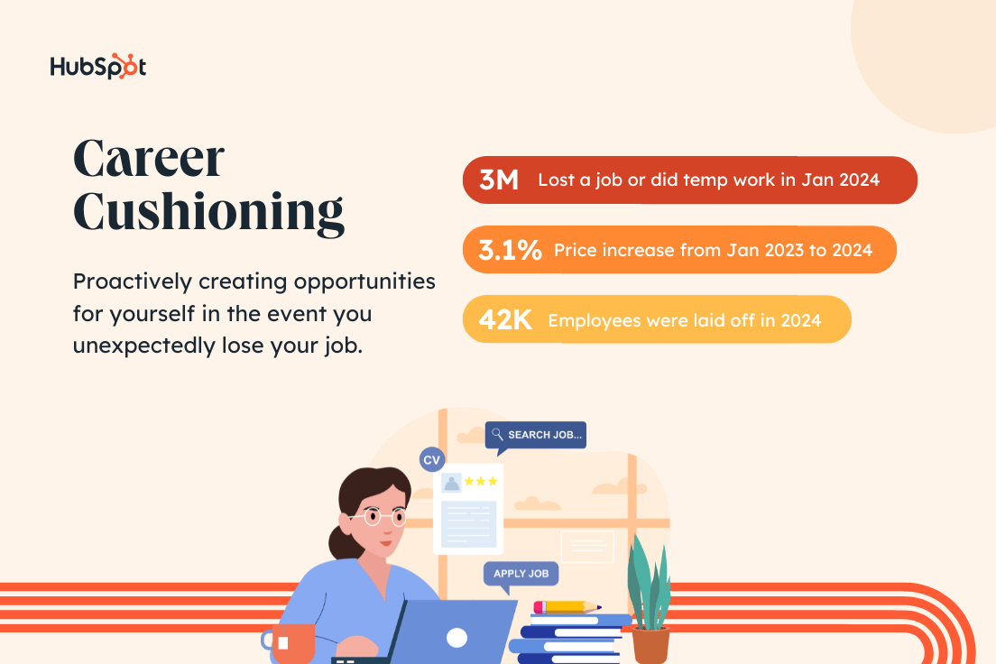
Should you start career cushioning?
This is very much a personal decision. However, to me, the data suggests that it might not be a bad idea to have a Plan B in your back pocket.
Here are some things to consider:
- Do you feel satisfied and secure at work? Lack of job satisfaction is another big reason professionals are making other plans.
- Does your skillset need a refresh? Upskilling is a career cushioning tactic, but it’s always a good idea to refine your expertise.
- Can you comfortably explore new opportunities? Career cushioning can be great, but don’t do it at the risk of losing your current job.
My take? I started my candle business for fun back in 2020. But, TBH, it’s nice to know I’d still have a source of income if I lost my job tomorrow.
How to Cushion Your Own Career
Here are five ways to do career cushioning right in 2024.
1. Skill up in both new and existing areas.
This is great advice whether you’re career cushioning or not. Skills are meant to be cultivated.
Sure, the same marketing frameworks I learned while completing my MBA in 2021 may still apply. But the skills needed to be a great marketer evolve with trends and time.
For example, you couldn’t have told me three years ago that I’d be using AI in my day-to-day workflow. But it’s here, and it’s a skill I had to (and wanted to) develop.
Luckily, there are tons of free resources, like HubSpot Academy, that are available to help you level up your professional skill set.
2. Keep your LinkedIn and resume updated.
Even if you aren’t ready to apply for jobs just yet, regularly update your work history as you make new accomplishments at work and in life.
Have you recently hit a target or goal? Did you master a new skill like we talked about in #1?
Write it down.
I promise, it’s easier to track those achievements on your LinkedIn or resume when they happen rather than trying to update things all at once. (Speaking from experience here.)
This is especially true if you’re in a bind and need to land a new job fast.
3. Nurture and expand your network.
I talked about keeping your LinkedIn updated in the last tip, but it’s so much more than just a resume.
LinkedIn is the perfect place to connect with like-minded people in your industry or make new professional friends.
With the right network, you’ll gain access to job listings, networking events, and referral sources for new opportunities.
Putting yourself out there and promoting your brand can go a long way toward creating a career cushion.
4. Start a business or explore a side hustle.
Becoming an entrepreneur is not easy, but it is doable if you find something you’re passionate about.
You could consider turning one of your existing hobbies into a side hustle. That’s how I became a candle business owner.
Or you could pick up some extra work related to an area or skill you’re interested in. Maybe you really like to write, so you pick up some freelance hours for one of your favorite blog sites.
Who knows, you may be able to turn that hustle into a full-time gig.
Whatever you choose, just don’t get into the candle game. I don’t need any more competition 😉
5. Don’t risk your day job.
Like I said, career cushioning is a great way to create a job safety net for yourself. But the whole point is to create a backup plan IF you need it.
Of course, if you’re already looking to change fields or switch up your career path, have at it. However, the key to career cushioning is to give yourself options in the event you lose your job.
Don’t unintentionally make that a reality by adding too much to your plate or neglecting your current employer.
In other words, “if it ain’t broke, don’t fix it.” Just cushion it.
The Bottom Line
If you ask me, it doesn’t hurt to explore new things and keep your options open.
To answer the question about whether I consider myself a career cushion-er, I’m going to go with … yes.
It’s about more than just my side hustle, though. I’m always looking for chances to learn new things and grow as a person.
And if that’s how you feel too, then I say it doesn’t hurt to add a little cushion.

![]()
15 Post-Purchase Email Examples to Inspire Your Next Campaign

I recently ordered a swimsuit online to get ready for a beach vacation. Choosing between hundreds of swimsuit styles after months in sweats is overwhelming, so I breathed an audible sigh of relief when I saw the order confirmation in my inbox.
I recently ordered a swimsuit online to get ready for a beach vacation. Choosing between hundreds of swimsuit styles after months in sweats is overwhelming, so I breathed an audible sigh of relief when I saw the order confirmation in my inbox.
I could almost smell the ocean and feel the sand under my feet in that moment.
That “shopping high” is a feeling of instant gratification and anticipation after an order. You can leverage this valuable window to boost customer loyalty and retention as a brand. To achieve this, you need the post-purchase email.
- How Post-Purchase Emails Drive Customer Retention
- The Best Post-Purchase Emails
- Best Practices for Post-Purchase Emails
![Download Now: 10 Templates to Master Marketing Emails [Free Kit]](https://no-cache.hubspot.com/cta/default/53/3def1e70-dcc7-436e-bffb-73211bd749f5.png)
How Post-Purchase Emails Drive Customer Retention
In the retail and e-commerce industry, email drives a whopping 45x ROI. Angie Jones, fractional CMO and author of the e-commerce newsletter The Brand Love Brigade explains why post-purchase emails are a powerful tool for customer retention.
“I’ve seen that the impact for brands who nail post-purchase campaigns is a higher retention rate and, ultimately, higher customer lifetime value (LTV),” Jones says. “The toughest leap to make is from the first order to the second, and post-purchase campaigns help do that.”
The Best Post-Purchase Emails
Ready to build on the brand momentum you’ve already built? Read on for my favorite post-purchase emails, why they work, and how to make them your own.
Order Confirmation (Man Crates)
First and foremost, your customer needs to know that their order is correct and has been received. Share the critical order details with your customer before anything else in an order confirmation email.
What we like: The celebratory image and saucy copy are exactly on-brand for Man Crates. However, it’s the icon progression that makes this order confirmation effective. Customers can tell from a glance where their order is in the process.
Below this, Man Crates follows a best practice of including the order and customer service contact details.
Shipping Confirmation (Etsy)
The following critical information you should share is a shipping confirmation when the package arrives.
What we like: I like how clean and effective Etsy’s shipping confirmation email is. The content is conversational and clear, reminding me of what I ordered with photos of my en-route items.
Etsy also uses valuable one-click order tracking to see where my package is — no copy/pasting a tracking number into a separate website.
Onboarding (Audible)
If a customer doesn’t understand a product or doesn’t use it, they’re unlikely to continue paying for it. Boost product engagement and customer retention with an onboarding email sequence.
What we like: Audible gives step-by-step, scannable instructions to help new subscribers use the app for the first time and discover content.
Technical Onboarding (Descript)
Onboarding is critical when you sell a complex or technical product like software. Set up onboarding sequences that guide your customers through adoption and offer support.
What we like: This onboarding email from podcast and video editing software Descript is a perfect example of an accessible way to help new users adopt the product.
Note the friendly design, five steps, video tutorials, and the invitation to join Descript’s user community.
Cross-Selling (Uncommon Goods)
Cross-selling is a common commerce strategy recommending similar or complementary products to recent customers.
This can be very effective since previous buyers already have experience with you and are more likely to buy again. Cross-selling can occur in a separate email or beneath your order confirmation (always place your order details first!).
What we like: This “You might also like” section from Uncommon Goods came in my order confirmation beneath my order details. The original order contained puzzles and games, so this recommendation tracks perfectly.
As a bonus, the email features other brand messaging, like their sustainability initiatives.
Loyalty Programs (Nani)
A loyalty or rewards program is the best way to build a loyal audience. Enrolling customers means you’ll have more data to analyze and can drive more orders by sending exclusive emails and incentives. But how do you convince them to join?
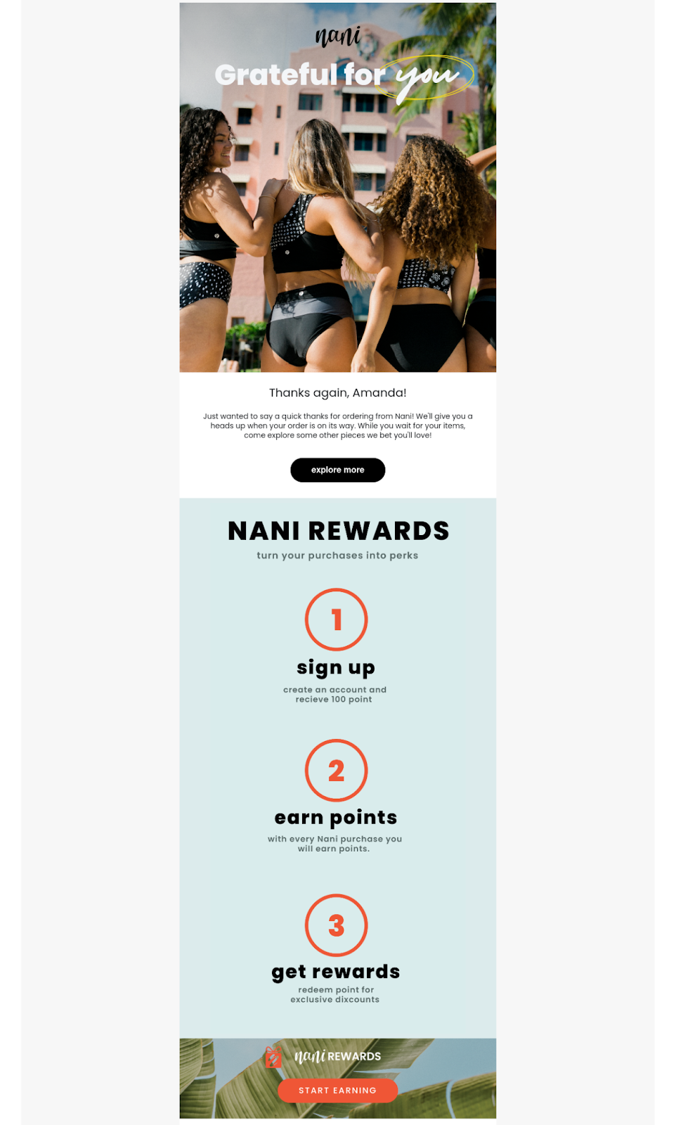
What we like: This rewards program email from Nani starts with gratitude and shares why you should sign up, with incentives like 100 reward points and exclusive offers.
The design pops, and the CTA is engaging (“Start Earning” versus “Sign Up”).
Benefits Reminder (Kohl’s)
It costs five times as much to acquire a new customer than to retain an existing one. That’s why you should work hard to build loyalty programs and show your members some love.
This can include sending special offers and promotions, but it should also include value-added content and fostering a sense of belonging.
What we like: Kohl’s is famous for its rewards program. This benefits email reminds members of the value they have access to for free, which builds brand loyalty and nudges them to return soon.
Giving a Return Incentive (Live Nation)
You can boost your LTV by giving customers a reason to wander back in (or visit your site). If you’re like me, the language you respond to best is money. Try either a discount, in-store credit, or extra loyalty points to encourage another visit.
What we like: Last year, I saw one of my favorite bands in concert. It was a great evening, and a few days later, this email with $20 concert cash landed in my inbox.
Concerts aren’t cheap, so I happily flagged this email in my inbox as I scoped out my next concert.
Upsell (Audible)
Once you have a happy customer, your next goal is to increase their CLV. A great way to do this is to offer an upgrade, also known as an upsell, from the product they’re currently using.
What we like: Audible’s upsell email is a master class in email design and messaging. First, it’s all focused on the value to the user (cost savings, access bestsellers, etc.).
Next, the comparison chart layout makes it easy to see the differences at a glance. With an enticing CTA above the fold and the promise of “Cancel anytime,” I think it’s a slam dunk.
Order Pickup (Target)
When an item isn’t being shipped, you might need to send pickup instructions. Don’t underestimate this step — it’s all a part of your user experience.
What we like: Bullseye will bring a smile to my face any day, but what has me smiling more is the clear steps on how to pick up my order and links to click if I need to extend my pickup window or contact the store.
Refer a Friend (MeUndies)
After a purchase, you want to give your customers a reason to share about it with their friends. A referral program is one way to incentivize your new customers to spread the word.
What we like: This referral email from MeUndies is fun and kaleidoscopic. There’s an incentive for both the referrer and their friend — driving the customer back to a return purchase.
Survey Request (Warby Parker)
One big reason you may want to send a post-purchase email is to collect feedback. This helps you improve, and it also helps you follow up with customers who may be less than satisfied.
I personally don’t like clicking through to a survey when I have no idea how long it’s going to be, so short post-purchase email surveys are best.
What we like: This Net Promoter Score® survey from Warby Parker is short (just one question) and shows respect for the customer’s time and opinion.
Survey Incentive (Express)
If you need more extensive feedback, consider offering your customer an incentive to participate. Offer a freebie, a worthwhile discount, or a charitable donation in exchange for their feedback.
What we like: Express’s survey email is bold and visual and focuses on the benefit to the consumer.
Asking for a Review (World Market)
Reviews can drive future sales and give you valuable insights into your product lines. But what’s the best way to prompt reviews without pestering customers?
What we like: It’s easy. It’s helpful. It’s fun. Rather than a generic ask, this World Market email shows me photos of every item in my recent purchase.
That visual evokes an emotional response (Yes, I loved that sesame seed shaker!), and I’m more likely to leave a review.
Buying Again (Starbucks)
Not only should you prompt people to return, but you can prompt them to buy the exact same item they’ve purchased before.
If you sell a skincare product and know that the average purchase frequency is every two months, for example, then you can prompt them to stock up when they’re running out.
With products like food and beverage, you can incentivize return purchases, building regular habits.
What we like: If you’re a Starbucks lover like me, you’re likely used to emails like this one. Not only are these post-purchase emails effective because they gamify earning points, but they’re personalized.
Customers are 80% more likely to buy from a personalized experience, so lean into personalization. You have the data. You just need to leverage it the right way.
Best Practices for Post-Purchase Emails
As many ways as there are to engage customers after a purchase, there are even more ways to frustrate your customers when you get it wrong. Find the balance between overwhelming them and adding value with these tips.
- Make the critical information easy to find. Keep order details, dates, and tracking codes at the top of emails, not buried in text.
- Get the timing right. Don’t send a review or survey request before an item has arrived or before the person has had a chance to use the product.
- Don’t ask for the next sale too soon. Focus on product adoption and brand loyalty before asking for another purchase.
- Test, test, and test again. Use A/B testing to find the right messaging and timing.
- Use automation for success. Use an email marketing hub with a CRM like HubSpot to automate customer journeys and email sequences based on customer actions.
Getting Started
Want to inspire that shopping high in customers? When you get post-purchase emails right, you turn that shopping high into long-lasting brand loyalty. You can build an audience of loyal brand advocates who return to buy again and again.

![]()
How to Use WordPress: Ultimate Guide to Building a WordPress Website

When you‘re just getting started with making a website, I know that the process of learning how to use WordPress can feel overwhelming. We’ve all been there, so you’re certainly not alone.
When you‘re just getting started with making a website, I know that the process of learning how to use WordPress can feel overwhelming. We’ve all been there, so you’re certainly not alone.
While WordPress does have a bit of a learning curve, I still think it‘s something that anyone can use to build a website — even people who have never done so before. That’s why WordPress is, by far, the most popular way to make a website.
To make the process as painless as possible, all you need is the right knowledge, which is what we‘ve created this post for. Below, I’ll take you step-by-step through how to use WordPress to build your very own website.
![Download Now: How to Launch a WordPress Website [Free Guide + Checklist]](https://no-cache.hubspot.com/cta/default/53/b5ae83fa-3a09-487e-a43a-4833bf87ab87.png)
I‘ll cover everything that you need to build your own WordPress site, starting from zero and working up to adding your own content and plugins. Beyond the step-by-step guide, I’ll also share a list of tips and tricks to remember while working with WordPress.
But first, let’s answer the question most people have when they begin thinking about their new WordPress website: What is the difference between WordPress.org and WordPress.com?
WordPress.org vs. WordPress.com
The difference between WordPress.org and WordPress.com has to do with who is actually hosting your website.
When you use the WordPress.org software (AKA “self-hosted WordPress”), you host your own website or blog using a third-party hosting provider. You’ll need to purchase web hosting and a domain name, install the WordPress software on your hosting, and then manage your site going forward. While most web hosting services give you a lot of tools to make this easier, it’s still a more hands-on experience than WordPress.com.
WordPress.com offers to host your website for you, more like a software-as-a-service tool (SaaS). You also don’t need to download any software or manage a server. You can either use a WordPress.com subdomain for free (e.g. yoursite.wordpress.com), or you can pay to use your own custom domain name (e.g., yoursite.com), which I think is a better approach for most websites.
How to Choose Between WordPress.org or WordPress.com
You may be wondering whether WordPress.org or WordPress.com would be a better fit. Let’s review a few more of the pros and cons that come with both options, so you can make an informed decision.
WordPress.org is ideal if you want full power over customizing and controlling your website. However, there is more responsibility that comes with managing a WordPress.org website. You have to purchase and set up your own domain name, upload and install plugins and a theme, update your website’s software, and maintain your website’s security. WordPress.org is free to use, but you have to pay for everything else that goes into having a website.
I think that WordPress.org is still definitely something that a non-technical user can handle, but it’s still not as easy as WordPress.com.
WordPress.com is preferable if you’re looking for an all-in-one option that has most of the hard work done for you. You’ll never need to manage your server, pay for your hosting, or buy a domain. There are also a number of customization options that come with a WordPress.com plan to help you make your website look the way you want it to.
WordPress.com has a free and paid version. If you stick with the free version, you can’t upload any custom themes or plugins, and you will have a WordPress subdomain. I think this makes the free plan unsuitable for most serious websites.
If you want to use your own custom domain name and install your own WordPress themes and plugins, you’ll need to pay for at least the WordPress.com Creator plan, which costs $40 per month (or $25 per month if you pay annually).
WordPress for Beginners: How to Use WordPress
There are a number of ways for you to create your dream website with WordPress. Users generally find the software easy to use, but I know that getting started can be understandably intimidating if you’re completely new to the process. That’s why we have built this “WordPress for Beginners” guide. Want a quick introduction before you dive deep? Check out this helpful video:
For even more resources, I’ve also compiled some of the best websites for learning about WordPress — these can be incredibly valuable sources of information as you start your journey.
Here’s how you can create your own WordPress site using either WordPress.org or WordPress.com.
1. Select a WordPress plan (WordPress.com only).
To start, you‘ll need to choose whether you’re using WordPress.org (AKA self-hosted WordPress) or WordPress.com.
If you want to use WordPress.org, you can skip ahead to the next step.
If you want to use WordPress.com, you’ll have to choose between the five preset plans that WordPress.com offers.
Again, I think that most people who are looking to make a serious website should choose at least the Creator plan. You’ll need this plan to install your own custom themes and plugins, which are some of the best parts of WordPress.
However, if you don‘t think you’ll need any custom themes or plugins, I think the Starter plan is also fine, as it lets you use your own custom domain name and removes the WordPress.com ads.
2. Set up your domain name and hosting provider (WordPress.org).
If you‘d rather use WordPress.org than WordPress.com, you’ll need to choose your hosting provider and set up your domain name before you can start building your WordPress website.
Before we talk about how to complete those tasks, I think that it’s important to discuss the difference between your domain name and hosting provider.
Think about your domain name as your website’s home address — it’s how your visitors are able to locate your website on the Internet. Your domain name will look something like this: www.example.com. For example, our domain name is hubspot.com.
Your hosting provider is like your house — it’s where your website files are actually stored. Without a hosting provider, your site wouldn’t have space on a server to “live.” Some of the best WordPress hosting providers include WP Engine, Bluehost, Rocket.net, and Kinsta.
How to Pick Domain and Hosting Providers
Again, WordPress.org requires you to purchase your own domain and find a third-party hosting provider for your website. WordPress.com allows you to decide whether or not you want a custom domain depending on the plan you choose, but it takes care of the hosting for you.
Your hosting provider is important because it impacts your website’s speed, security, and reliability. There are hundreds of providers to choose from, which is why we put together a list of the best WordPress hosting providers to help you decide what will work best for you. All of these providers meet WordPress’s three basic hosting requirements:
- PHP version 7.4 or greater
- MySQL version 5.7 or greater OR MariaDB version 10.4 or greater.
- HTTPS support
When considering hosting providers for your WordPress site, make sure they meet all of the above criteria.
For domain names, getting one is as easy as searching and purchasing one through your domain registrar of choice. Many web hosts also offer their own domain registration services, and some will even give you a free domain name for the first year.
If you are new to WordPress but have already purchased and created a domain name elsewhere, no problem — you’ll have the option to transfer or map it to your WordPress website.
For the sake of this guide, let’s assume you do not yet have a domain or hosting provider. Here’s how to start creating your website with the popular hosting service Bluehost.
First, head to Bluehost’s WordPress hosting page and click View Plans.
From here, you’ll be taken to Bluehost’s pricing page to choose from four plans.

I recommend using the Choice Plus plan if it fits your budget, but the Basic plan is fine if you want to keep costs as low as possible.
Once you choose your plan and click Select, you’ll be taken to another page to sign up with a domain name (which is free for the first year).
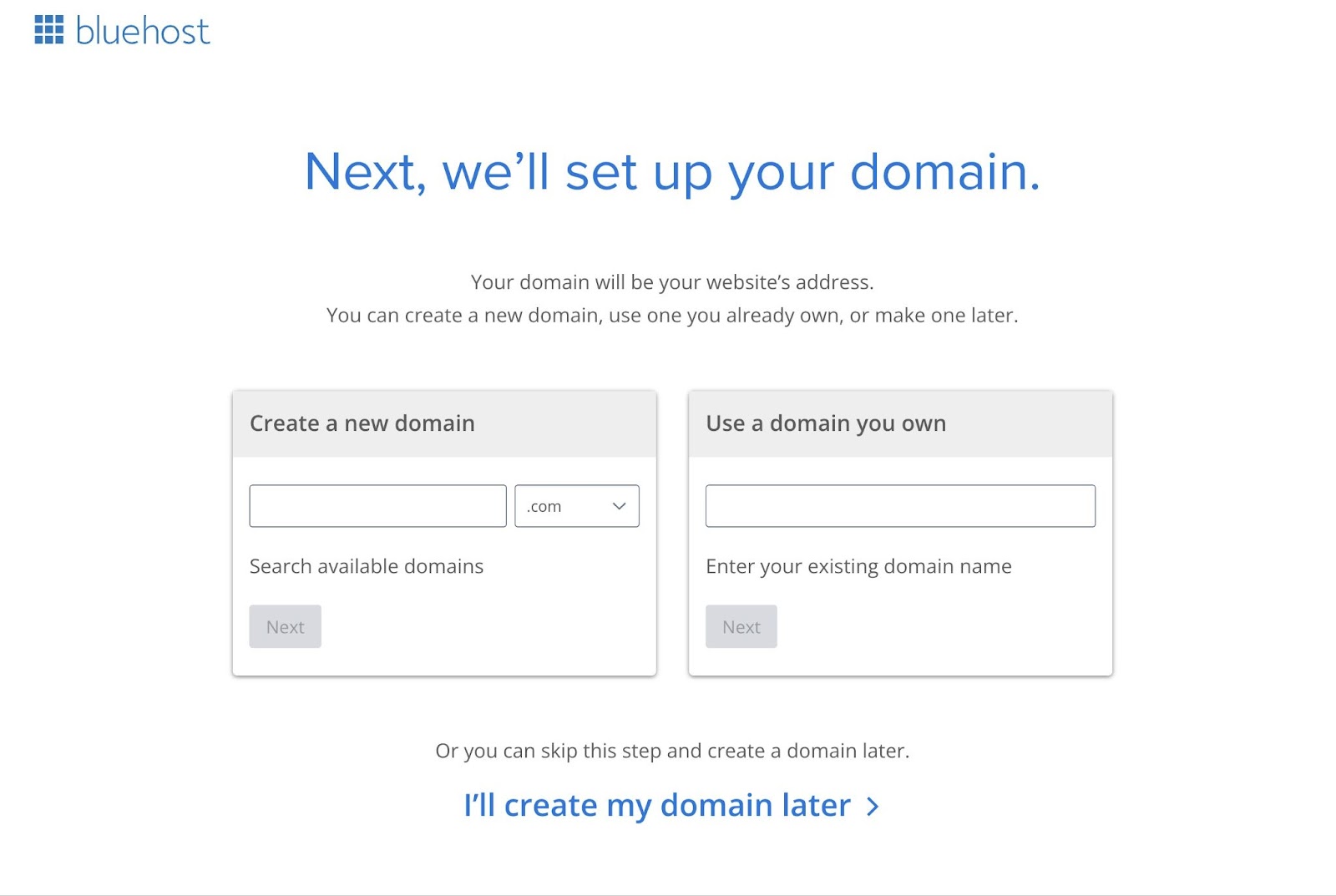
Once you select your domain name, you’ll be brought to a page to complete your account and billing information for your purchase.
I don‘t think most people need any of the Package Extras, so feel free to disable them. For example, Bluehost already offers free SSL certificates via Let’s Encrypt, so there’s no need to purchase the Single Domain SSL add-on.
After confirming your account and purchasing your domain, you will gain access to your hosting dashboard, where you’ll be able to install the WordPress CMS.
3. Install WordPress.
If you are using your own WordPress hosting provider (instead of WordPress.com), you’ll need to install the WordPress software to connect your new domain to your website.
To make this as easy as possible, most web hosts offer simple one-click WordPress installer tools. I think it’s also worth noting that some WordPress hosting services will pre-install WordPress for you as part of the hosting account setup process.
For this example, let’s continue using Bluehost. However, I think the same general principles that you see here will apply to pretty much any WordPress host.
To start, log in to your Bluehost account, select Hosting on the left side, and click Add Site.
On the next screen, choose the option to Install WordPress.
You can then give your site a title and choose which domain you want to connect to this site (you should already see your domain name if you chose a free domain name when signing up for Bluehost).

After you click Continue, there will be a short wait while Bluehost installs WordPress for you.
Once the installation process finishes, you’ll see an option to Log Into WordPress, which will take you to your WordPress dashboard.
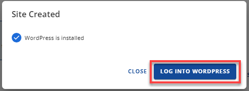
As I mentioned above, the process will look slightly different if you’re using another WordPress host, but the basic steps will be the same.
For example, here’s what the WordPress installer looks like at Rocket.net, a dedicated WordPress host:
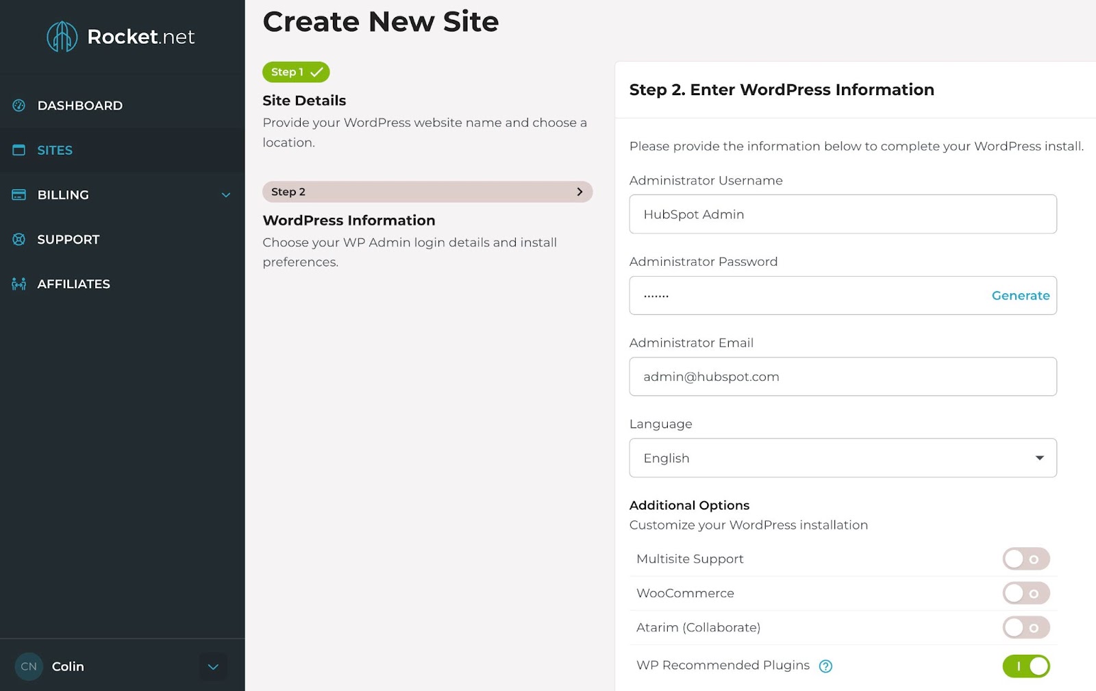
Now, on to step four: making your website look nice.
4. Choose your theme.
You can customize your WordPress website’s design using WordPress’s many themes and templates, each of which contains a multitude of layouts, formatting styles, colors, fonts, and other visual options.
When you first install the WordPress software, WordPress automatically applies a default theme that looks rather plain. Instead of using that default theme, I recommend installing a new WordPress theme that matches your preferred design aesthetic.
You can find thousands of free or paid themes, so you’re almost certain to find a design that you like.
We have a post on our favorite WordPress themes and a guide on how to choose your WordPress theme. For most people, though, I think that choosing a lightweight multipurpose theme like Astra, Kadence Theme, or GeneratePress is a great place to start.
All of these themes are multipurpose (which means you can use them for any type of site) and include dozens or hundreds of importable “starter sites.” This basically means that you can import a starter site design with just a few clicks and then instantly have a beautiful website.
To find a theme that works best for you in WordPress.org, head to your WordPress admin dashboard. Click Appearance, then Themes. Then, click the Add New Theme button at the top.
You’ll be brought to another screen where you can browse available themes or search for a specific one you have in mind.

IMG: theme
Once you find the perfect theme, you can install it to begin customizing. Each theme has different steps required during the customization process, so be sure to follow them closely.
Generally, you can customize most WordPress themes by going to Appearance, then Customize.
If you choose one of the newer “Full-Site Editing” themes, you can customize it by going to Appearance, then Editor.
For more details, we have a whole post on how to customize a WordPress theme. You can also consult your theme developer’s documentation for instructions that are specific to your chosen theme.
5. Add posts and pages to your website.
When you add content to your WordPress website, it’s usually displayed in the form of posts and pages:
- Posts — Use these when you want to create blog posts or other similar content. New posts will automatically appear at the top of your blog listing page, and each post will have its own public publish date.
- Pages — These are better for static content that doesn’t have a publish date. For example, your “About” page, “Contact” page, and so on. There‘s no default page that lists all of your “Pages,” but you can add links to them using your site’s navigation menu or other areas.
For more advanced use cases, you can also create your own WordPress custom post types. However, I don’t recommend going that route until you become more familiar with the WordPress software.
To add a post to your website, go to the admin dashboard, click Posts, and then Add New Post.

To add text, you can just click in the editor and start typing. For other elements — e.g., images or buttons — you can add blocks to the editor.
For more details, we have a whole guide on how to use the WordPress block editor.
When you’re finished, click Save Draft to save your changes as a draft, or click Publish to immediately take the post live.
Adding a page to your website is a similar process. In your admin area, click Pages, then Add New Page.

You can then add content using the block editor and Publish it when you’re finished.
6. Customize your website.
Beyond the theme you choose, there are a number of ways to further customize your website. I think that now is a good time to review a few options.
First, you can customize your site title. From your admin dashboard, select Settings > General. Here, add your website title and tagline. You can also toggle other basic site information like your URL, email, time zone, and more.

Next, you can customize your reading sections. Under Settings > Reading, you can change your homepage to a static page.
By default, WordPress will display your latest blog posts on your site‘s homepage. If your website isn’t a dedicated blog, you’ll probably want to show a static homepage instead.
You can create your homepage as we showed you above (Pages → Add New Page) and then assign it in this settings area.

You can also customize your WordPress site’s navigation menu, which can help your visitors to easily find information on your website.
Add a navigation menu by going to your admin dashboard, clicking Appearance, and then Menus.
If you‘re using a new “Full-Site Editing” theme, you’ll go to Appearance and then Editor instead. However, most popular WordPress themes still use the Menus interface.

From here, you can determine how you want your navigation menu to look, how many pages you want to include, what you want to title those pages, and what order you want them to be listed in.
The exact design of your navigation menu will depend on your WordPress theme.
Of course, this is just a fraction of what you can do in the dashboard — this post offers more information on your WordPress site settings and customization options.
7. Install plugins.
WordPress plugins are pieces of software that add functionality to your WordPress website and enhance the user experience. You can use plugins for small features (such as adding a contact form) or big features (such as turning your site into a fully functioning online store).
With over 59,000 free plugins in the WordPress.org directory (and thousands more at other locations), there are options for almost every type of website and user. Some of the most popular plugins available include:
- HubSpot WordPress Plugin. Easily add pop-ups, forms, and live chat to your WordPress website. And, as an added bonus, pair this plugin, or other CRM plugins, with your HubSpot CRM.
- All in One SEO. A top-rated SEO plugin that’s used by businesses to improve their rankings and uncover new SEO growth opportunities.
- The Events Calendar. An effortless events calendar that makes scheduling events from your site easy.
- Yoast SEO. The go-to plugin to help you with on-page SEO. This app makes sure you’re following best practices before you push your site live.
- TablePress. Need a table on your site? Look no further.
- The SEO Framework. Another plugin that can help you master SEO on your site.
- Weglot. A top translation plugin for translating WordPress and WooCommerce websites.
To discover even more options, we have a whole post on the best WordPress plugins. You can also search the HubSpot blog for lists of plugins for specific use cases, such as the best WordPress survey plugins.
To install a new plugin, head to the Plugins section in your admin dashboard. This shows you all the plugins currently installed on your site.
Depending on your host, you might have several plugins installed already. Note that for a plugin to work, you must activate it after installing.

To add a new plugin, click the Add New Plugin button (or go to Plugins, then Add New Plugin). Search for your desired plugin and then click Install Now, wait a few seconds, then click Activate.
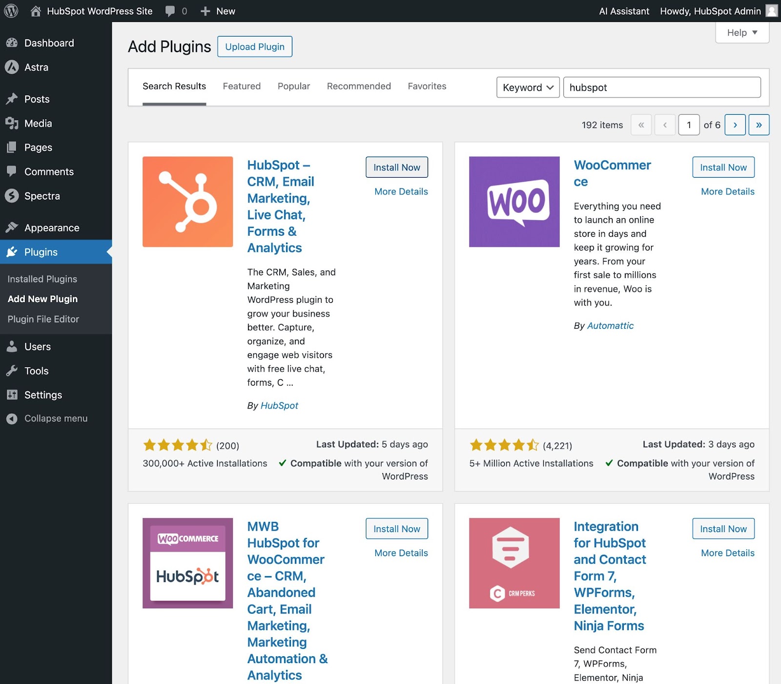
For plugins that are not listed in the WordPress.org plugin directory, you can also upload a Zip file by clicking the Upload Plugin button at the top. You’ll typically use this approach if you purchase a premium plugin directly from the developer.
Get the WordPress CRM plugin that helps you organize, track, and nurture your leads.
8. Optimize your website to increase page speed.
Website performance is a critical part of the user experience. If a page takes too long to load, your visitors will move quickly to another site. You don’t want to frustrate visitors with slow speeds.
Choosing quality web hosting is one way to ensure that your site loads quickly. Beyond that, you can implement essential WordPress performance best practices such as page caching, code optimization, image optimization, and so on.
For an easy way to implement all of these important strategies, WP Rocket is a WordPress caching plugin that will make your site faster in a few clicks. Thanks to powerful options such as Remove Unused CSS and Delay JS Execution, you’ll save time and effort while improving your Core Web Vitals grades, the PageSpeed Insights score, and the overall loading time.
9. Get inspired by WordPress website examples.
As you begin to customize your website, you may feel overwhelmed by all the options you have. Instead of starting completely from scratch, it helps to grab some inspiration from other exemplary WordPress websites.
Here are some of our favorite WordPress website examples.
99% Invisible is a popular podcast that focuses on design and architecture. The 99% Invisible website is sleek and modern. It offers easy navigation for visitors to quickly access each podcast episode.

The Houston Zoo’s website displays its main attraction on the homepage. The magnifying glass icon on the top menu bar makes searching the site effortless.
Awesome Motive, the creator behind several WordPress projects, engages visitors with a polished, yet simple, website. It features subtle animation to grab people’s attention.

WordPress Website Tips and Tricks
There are a number of WordPress tips and tricks to make your website as impactful and user-friendly as possible — we’ve listed them below to help you do just that.
1. Use dashes and not underscores.
When naming your files, use dashes and not underscores. Google looks at underscores as joiners, meaning your file will look like one big word. That won’t help you with your SEO. Use dashes to make it obvious there are separate words.
For example, use www.example.com/this-is-an-example, not www.example.com/this_is_an_example.
2. If you built your website with WordPress.com, use its online support.
When building websites, you’ll probably have one or two questions — maybe more than that. That’s where WordPress support comes in. If you have any questions, check out their support documents. You’ll find a number of forums and ways to reach out to WordPress experts listed on their website.
3. Back up and update your website regularly.
Backups sound like extra work until you hit a technical roadblock and need a hard refresh. If you ever lose access or have technological difficulties, you have everything you need to completely restore your content.
There are a number of plugins, such as Snapshot Pro, made specifically for backing up your WordPress site. Your WordPress host might also offer its own backup tool.
Beyond that, you need to update your WordPress site and plugins regularly. WordPress will tell you when updates are released. This will keep your website looking fresh and working efficiently. It’s also important to protect your site from newly discovered security vulnerabilities.
Updating your website is also an essential security best practice. Updates keep your site secure to ensure no hackers can take advantage of system vulnerabilities. Again, there are plenty of plugins, such as WP Defender, to help you with security.
4. Understand SEO.
Learn and understand SEO basics to ensure your website is completely optimized so you can boost your conversions. Research which keywords you want to rank for and use them throughout your copy. You can even start a blog so you can share your knowledge while improving your ranking.
Beyond that, make the most of multimedia. Image alt text on photos can give you an extra boost. Visuals and video content can also break up the text on your website pages.
Create custom permalinks. Permalinks are the permanent URLs that you plan to keep static for the foreseeable future. They’re important because they improve user experience and enhance your WordPress website SEO. We have a guide on choosing an optimized permalink structure.
Keep an eye on your website’s performance and know what is and isn’t working for your visitors. There are a number of useful WordPress plugins, as well as Google Analytics software, to help with this.
5. Create a custom homepage.
As mentioned earlier, WordPress will provide you with a default homepage. Take the time to create your own with a theme that works for your business — remember, this is your visitor’s first impression of your business, blog, or portfolio.
Pro tip, you can feature social proof on your home page to show your new website visitors how many other people have already viewed your content. There are plugins to help you do this in a matter of minutes.
6. Include an “About Us” page on your website.
Your customers want to know who you are. That’s where your About Us page comes in. Show your visitors that you’re a trustworthy person and/or business. “About Us” pages are known to be one of the most-visited pages on websites (after homepages) — so introducing yourself is important. Here are some “About Us” examples to inspire you.
7. Make the most of your blog posts.
Include excerpts on your blog posts so people don’t land on your blog page and see your entire piece at once. By only including excerpts on your blog page, you make room to list all of your blogs in one location. Visitors can then read the excerpts and click through to read the posts they are most interested in.
8. Consider what your website looks like on mobile.
It’s no secret that people are searching the Internet while on their phones, tablets, and other mobile devices these days. All modern WordPress themes are “responsive,” which means they work on different devices. However, I still recommend browsing your site on mobile to catch any issues or quirks.
9. Pick a CRM that works with your WordPress site.
A CRM can help you keep track of the way users are interacting with your website and company. You’ll have the opportunity to see what offers are garnering the most attention and becoming leads. Here’s a list of some of the best WordPress CRM options. You can also get started with HubSpot, which has its own WordPress integrations.
Build a Website With WordPress
Having a great website matters. It’s how you connect with your visitors and leads, create a positive first impression with new users, and boost conversions. The good news is creating your own website doesn’t have to be a daunting process…at least not with WordPress.
The easy-to-use CMS offers completely customizable plans suitable for all needs. With no prior knowledge necessary, you can start building your own site for your business, blog, portfolio, or online store immediately.
![]()
7 Email Banner Examples I Love (For Your Inspiration)

Last week, I was drinking coffee when an email from Adidas popped up.
At the top, I could see my 9,000+ loyalty points displayed prominently in the banner, along with an offer that immediately caught my attention: a 30% discount on my next purchase if I redeemed those points.
Last week, I was drinking coffee when an email from Adidas popped up.
At the top, I could see my 9,000+ loyalty points displayed prominently in the banner, along with an offer that immediately caught my attention: a 30% discount on my next purchase if I redeemed those points.
I quickly forgot my initial plan for a quiet coffee and was intrigued and excited by the potential savings. Points I’d accumulated from previous purchases, which I hadn’t thought much about, now seemed like gold.
That’s precisely what an impactful email banner does. It tempts you and turns a routine email check into an exciting shopping spree.
Here, I’ll share what an email banner needs to include to have that effect and highlight seven of my favorite email banners that haven’t only caught my eye and compelled me to take action.
What is an email banner?
A banner is a visual element at the top of an email that complements the marketing copy.
A banner is a great way to immediately set the tone for the message’s content and to create a lasting visual impression in the recipient’s mind.
Here’s what that exciting email banner from Adidas looked like:
Brand banners can range from simple designs featuring the brand’s name and logo to elaborate promotions.
These banners differ from signature banners, which you can find at the bottom of an email.
Banners are designed to capture your attention right from the start, while signature banners typically contain contact information, a professional sign-off, or links to social media handles.
What to Include in an Email Banner
While email banners have plenty of room for creativity, a few standard elements are a no-brainer. Include these elements for an impactful banner:
Brand Logo or Name
A brand logo and name in your header is the first thing people see. It sets the tone for the rest of your email content, reinforces your brand identity immediately, and lends credibility to your message.
For example, here’s a banner from PayPal featuring its logo:
See how the design is simple and the logo visually apparent? Follow the same guidelines to incorporate your brand name and logo. PayPal’s background colors also complement each other and don’t clash.
Lastly, consider the size of your logo and name — PayPal’s logo is large enough to be easily recognizable but not so large that it overpowers the rest of the banner’s content.
Brand Colors
Using your brand colors in your email banner reinforces brand identity and ensures visual consistency. It’s much easier for recipients to recognize your email as a visual signature.
The key is not to play with too many colors. Keep your brand look professional and cohesive by using a limited color palette. Also, ensure the contrast between the background and text colors is enough to make your content readable.
Link to Your Website
Adding a link to your website in your email banner is a strategic move and is especially relevant for e-commerce emails. It provides a direct pathway for recipients to shop or explore your offerings.
For an e-commerce clothing store like H&M, links to specific categories guide customers to what interests them and make the shopping experience smoother.
Pro tip: Make these links visually distinct and easy to find. Use clear, concise text or icons that represent each category.
Apart from this, ensure these links are mobile-friendly, too, since 56% of marketers use mobile-friendly emails in their email marketing strategy — and you don’t want to fall behind.
Current Promotions or Announcements
Highlighting current promotions or offers can reduce bounce rates and put your best deal front and center so nobody misses it.
A banner featuring a special sale, event announcement, discount code, or limited-time offer adds a sense of urgency to your message, encouraging subscribers to act quickly and not miss out.
Make the promotion clear and straightforward with bold, legible fonts and colors that make a statement but still fit your brand’s look. It’s also essential to keep the timing in mind.
Keep your audience engaged by updating your banner with the most relevant offers.
Personalization Elements
Personalization elements, whether email or SMS, make any message feel more tailored and engaging to each recipient.
Litmus’ research shows that 80% of customers are more likely to purchase a personalized experience. And why not?
Customized emails are like greeting someone by name when they walk into your store — it makes the interaction feel more personal and welcoming.
Personalization can be as simple as including the recipient’s name in the banner or as complex as showcasing products based on browsing history.
Start with the basics. Use your email platform’s personalization tokens to insert names or relevant details into your banner. But keep it relevant, too. Make sure personalized content aligns with the recipient’s interests.
You increase your chances of making a meaningful impact with this approach.
The Best Email Banners
I’ve shared some examples and fundamental elements of email banners earlier, but how do you bring these together?
In this section, I’ll share seven of my favorite email banners that are unique in their way and will get your creative juices flowing:
1. Hootsuite

I love Hootsuite’s email banner. The tagline, “Get this deal before she melts away!!” adds personality and character to the email. This creative touch made the email memorable; I remember it even days later.
The brand also stuck to its brand guidelines with consistent colors and fonts. While the message is fun, it’s still unmistakably Hootsuite. This consistency reinforces brand identity in my head and cements these colors’ association with Hootsuite.
What I like: An orange-ish red for the CTA button was strategic. Research shows that red tones convey urgency and importance, encouraging me to click through. The color choice also fits within Hootsuite’s brand guidelines.
2. Old Navy
Old Navy’s email banner did a great job of making me feel like a loyal customer. I learned about an offer with the tagline “get FREE shipping on $50+ orders” and how it integrates personalized elements to improve my shopping experience.
Links to categories such as women, men, and gifts also make it easy for me to shift my focus to the website.
What caught my eye was how the banner summarized my rewards and points and even included my name. This personalization makes the shopping experience convenient and relevant by giving me a snapshot of where I stand.
What I like: The banner creatively uses space to combine several elements (offers, navigation, and personalization) without overwhelming me. It’s this balance between information and design that gets the message across.
3. Amazon Business
Amazon Business’s email banner caught my eye with its transparent, straightforward approach. It highlights a 30% discount on my first order up to £200 (around $252.64 USD), an offer that was hard to ignore for me.
What’s smart about their design is the clean, simple background they chose. There aren’t too many distractions, making the discount offer the show’s star.
The picture of the stapler in the banner is also quite cute. This fun and relevant element speaks directly to me and my needs and makes the entire message feel personalized and thoughtful.
What I like: Including a common office item, like a stapler, cleverly emphasizes the relevance of Amazon Business’s offerings to the everyday operational needs of small businesses.
It’s a subtle yet effective way to connect with the audience on a practical level.
4. Shopify
This headline and tagline combo from Shopify immediately resonates with me as a business owner. It promises constant ideas to help me keep my business competitive and creative.
The playful visual elements like stars and a smiley in place of the “i” dot also added a lighthearted, approachable feel to the banner.
These graphic elements and the gradient background make the banner attractive and reinforce that Shopify makes business fun and easy.
What I like: The inclusion of the Shopify logo and a subtle “Start free trial” text at the top right corner offers a clear next step without being too pushy.
I like how it’s a reminder that behind the engaging content and the vibrant community lies an opportunity to directly experience what Shopify offers.
5. Outreach
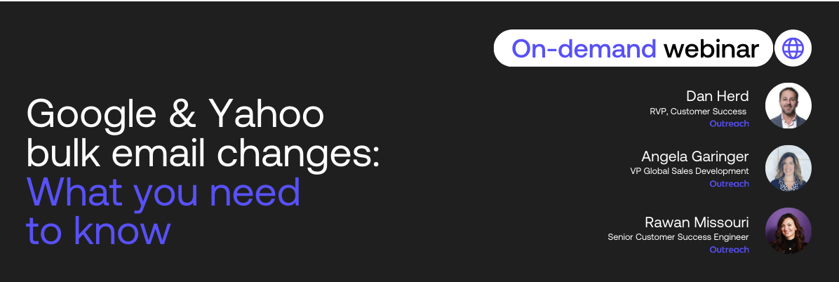
Outreach’s clear and informative email banner is extremely value-packed. The brand is promoting a webinar against a clean black background to ensure the focus stays on the webinar title and the presenters.
My favorite part is how Outreach included the three experts’ names, roles, and pictures. The design is simple and elegant. Bringing it all together, the email is an introduction to these experts.
What I like: There’s no logo on the banner. It focuses my attention entirely on the webinar’s content and the experts presenting it.
This decision might seem unconventional initially, but it allows the message about the webinar and its relevance to take center stage without distractions.
6. Holt Renfrew
Holt Renfrew’s banner starts basic. The logo at the top and direct links to categories like women, men, home, and kids help me navigate the email more quickly if I want to explore their products.
The email shines in its vibrant promotion of the sale that boasts “UP TO 80% OFF” on a neon green background. This choice of color is bold and eye-catching and makes it impossible to miss the sale announcement.
Despite the potential for visual overload with such a bright background and including details like “select sales final,” the banner conveys all these elements without being overwhelming.
What I like: A neon green background is unconventional for a luxury brand, usually using more subdued, elegant color schemes.
Neon green grabs my attention and infuses excitement and freshness into the promotion to show that it’s worth checking out.
7. Uber Eats
Uber Eats’ email banner stood out because of its colorful oranges and avocados. This shade of green in the background matches its brand colors and makes the fruits and vegetables look fresh.
The offer (“Enjoy 30% off produce every Fresh Tuesday”) is clear and builds excitement for weekly savings. It creates a sense of anticipation for weekly deals and encourages me to return and save on my fruits and veggies.
What I like: The banner is very straightforward. It communicates the deal without overloading me with details since the entire focus is on fresh produce.
Taking advantage of the weekly deal is tempting, and using brand colors and new imagery reinforces Uber Eats’ value to me.
Creating Email Banners that Work
Email banners require a lot of thought — and a lot of tact, too. They vary from industry to industry and audience to audience, so what works for one brand may not work for another.
So, how do you know what works? Simple: Test it out. Remember these fundamentals (and inspirations) to create a batch of email banners and see what works for your audience.
Monitor metrics like click-through and bounce rates to measure what engages your audience. A little trial-and-error pinpoints you to elements that click with your audience and make them take the actions you want.
![]()
5 Marketing Trends That Might Not Survive in 2024 [HubSpot Research + Expert Insights]

Few marketing trends last forever. In reality, they come and go at rapid speed — and marketers must adapt.
Few marketing trends last forever. In reality, they come and go at rapid speed — and marketers must adapt.
Because marketing is always evolving, your marketing playbook should, too. But if your strategy looks the same as years prior, it’s time to do some housekeeping.
Here, we’ll cover five marketing trends that are losing steam and how marketers can respond.
![Download Now: Free State of Marketing Report [Updated for 2024]](https://no-cache.hubspot.com/cta/default/53/b0f73a5e-16e4-41fd-9511-8564efc560a7.png)
1. Account-based marketing.
In 2023, only 13% of marketers leveraged account-based marketing (ABM), according to HubSpot’s annual State of Marketing report.
To Dustin Brackett, CEO and Founder of HIVE Strategy, this makes sense. As he told me, “While I strongly believe in ABM and the power it has for organizations trying to sell into a targeted list of other organizations, I can see why it will never be at the top of the marketing trends lists. ABM is really only valuable for organizations that have high-value customers. There isn’t a ton of ROI to be had by investing in ABM for a B2C organization, or any organization that has a lower customer lifetime value because ABM is a large investment in time, resources, and dollars.
Matt Freestone, Managing Director at Unmatched, sees many of his clients investing in ABM. However, he believes the resistance to ABM comes from sales and marketing alignment issues.
As he puts it, “We’ve found that the reason ABM tends to not be utilized by marketers is that many businesses still have sales and marketing alignment issues. I think ABM will see a resurgence in 2024, as long as Sales and Marketing teams can come together, build effective campaigns, and share common goals.”
Finally, Katherine Forbes, Senior VP of Marketing at Creative Circle, believes ABM isn‘t topping the ’marketing trends of 2024‘ list because it’s become status quo for most sales reps. As she puts it, “The ABM approach has become so mainstream for B2B businesses that it can no longer be considered a differentiating tactic or a trend. In fact, it likely is the foundation of a typical seller’s sales methodology, rather than an approach employed solely by marketing teams.”
She adds, “ABM is still a productive tactic, but marketing teams (such as ours) may be better off focusing on delivering a white-glove and personalized experience through their e-commerce and self-service options. According to a Gartner, Inc. survey of 771 B2B buyers, 75% of B2B buyers now prefer a rep-free experience, but those who purchase through digital channels alone are more likely to regret their purchase.”
2. The metaverse.
Marketing is all about experimentation, and the metaverse became a new playground for marketers to explore. However, this initial excitement seems to be fizzling out.
In 2024, 14% of marketers plan to stop marketing in the metaverse (e.g. Horizon Worlds and Roblox). In addition, 13% plan to stop leveraging VR and AR.
Although the metaverse is intriguing, it’s proving difficult to execute. The equipment is expensive, the hardware is uncomfortable, and adoption is slow.
Adrian Alexandrescu, CEO of Mediapost Martech, says, “I wasn‘t a big believer in the whole Metaverse concept, as it seemed too much like something inspired by movies such as ’Ready Player One.‘ Fast forward to today: most of our clients haven’t invested a dime in Metaverse Marketing, Roblox, or similar platforms and have absolutely no plans for the near future to do so.”
That said, the metaverse is still in its infancy. As it continues to evolve, things could turn around.
3. Podcasts and other audio content.
This one surprised me. As a consumer, I listen to podcasts daily. And I’m not alone – around one in four internet users listen to podcasts, and in 2024, there are over 500 million podcast listeners.
So why wouldn’t podcasts be appealing to marketers?
As Blend’s Marketing Manager Dan Stillgoe told me, “Businesses are often quick to shutdown podcasts because they don’t see direct ROI from them. It’s true that you can’t directly attribute leads or revenue from a podcast, but that’s not its purpose. Podcasts are a long-term brand-building channel that can improve affinity and connection for your brand like no other channel. When you realize the long-term and surrounding benefits, podcasting becomes a clear and obvious investment.”
He adds, “Podcasting is the perfect way to craft content that’s engaging and authentic — something buyers are beginning to crave in this AI era.”
Additionally, I’m assuming some marketers feel the barrier-to-entry is a little high. Creating a full, high-quality podcast episode requires time and resources. It takes more effort than, say, posting an Instagram Reel, and it‘s harder to track ROI. But while it’s not easy, it’s worth considering if most of your consumers are podcast-listeners.
4. Audio chat rooms.
If you’ve been keeping up with tech news and tech publishers like TechAcute, you probably have come across an audio chat room at some point. Audio chat rooms — like Clubhouse and Twitter Spaces — surged in popularity during the start of the pandemic, when many people were seeking opportunities to connect with others.
Fast forward to today, and more than a quarter (14%) of marketers are planning to stop investing in audio chat rooms in 2024.
Additionally, only 13% of marketers invested in audio chat rooms in 2023.
From a marketing perspective, the biggest problem with audio chat rooms is that users prefer to speak with people — not brands.
Stephen Lackey, VP of Marketing at SmartBug Media, says, “The transient nature of audio content in these rooms makes it challenging for marketers to create lasting impressions. Unlike visual or written content, which can be revisited and shared easily with direct attribution, spoken words dissipate into the digital ether, making it harder for brands to maintain a sustained presence in users’ minds.”
He continues, “Moreover, the lack of visual elements restricts marketers from leveraging the power of visuals and multimedia content, a cornerstone in digital marketing in the upcoming year. Without the ability to showcase products or services, marketers struggle to engage their audience effectively, potentially losing valuable opportunities to convert interest into action (especially considering the significant time investment required for these platforms).”
Rather than leaning into audio chat rooms, Lackey suggests marketers focus on platforms that allow for a more controlled, visually engaging, and scalable approach.
5. User-generated content.
In 2024, 13% of marketers plan to decrease their investment in user-generated content (UGC).
There could be several reasons for this, including:
- Quality concerns: It can be difficult to maintain a consistent brand image when you‘re relying on content created by users, and that content might not always be as high-quality as you’d like.
- Limited control: Marketers have limited control over messaging when they’re reposting user-generated content. Additionally, it can be much harder to monitor comments and engagement on those posts.
- Difficulty in tracking ROI: It is difficult for marketers to track ROI on user-generated content.
During this tumultuous time where consumer preferences and behaviors are changing rapidly as a result of AI and shifting algorithms, marketers might prefer to keep full control over the content they produce – particularly since it’s easier to track impact on their own content.
However, when I spoke with Emplifi’s Chief Strategy Officer Kyle Wong earlier last year, he highlighted the importance of UGC, telling me, “When investing in a strategy around user-generated content, it’s important to understand the basics, which is this: We are investing in a strategy to essentially help capture more positive word-of-mouth marketing from our customers.”
I don’t think UGC is going away, but I could understand why marketers might be temporarily decreasing their investment as they consider how consumer preferences and behaviors are changing in 2024 — particularly with the current popularity of influencer marketing, instead.
Back to You
Marketing is always evolving, so your marketing playbook should, too. As we inch closer to 2023, it’s essential to take stock of which trends you want to leverage, and which ones are better left behind.

![]()
I Asked ChatGPT to Write 5 Types of Counteroffer Emails — Here’s What I Got

You’ve made it through multiple rounds of interviews, the hiring team has selected you as their top candidate, and they’ve made you an offer. But you aren’t quite satisfied with all of the terms. This is where a counteroffer comes in.
You’ve made it through multiple rounds of interviews, the hiring team has selected you as their top candidate, and they’ve made you an offer. But you aren’t quite satisfied with all of the terms. This is where a counteroffer comes in.
Counteroffers are expected. If you haven’t written a counteroffer email before or feel like it’s not something you need to do, it may be time to reconsider.
According to a survey from Fidelity Investments, 85% of people who make a counteroffer receive at least some of what they negotiated. This can include an adjustment to the salary, terms, or benefits.
If you’ve never written a counteroffer email, you probably don’t even know where to start. Below, I’m breaking down exactly what a counteroffer is and how to make one. I also asked ChatGPT to help write a few counteroffer emails to give you an idea of what one looks like so you can start practicing writing your own.
What is a counteroffer letter?
A counteroffer letter is a letter, typically an email, that candidates send to a hiring team to negotiate the terms of a job offer. A counteroffer email is sent before formally accepting a job offer as part of the negotiation process. Counteroffers can negotiate any part of the offer, from the base salary to bonuses to work schedule.
How to Give a Counteroffer
To understand exactly how to write a counteroffer email, I spoke with Sarah Johnston, founder and CEO of executive resume writing and interview coaching firm Briefcase Coach. Here are the steps she recommends following when you have an opportunity to give a counteroffer.
Affirm you want the role.
Before you state your counteroffer, you need to affirm that you want to move forward with the company. Start by letting the recruiter or hiring manager know that you appreciate the offer and you’re excited about the opportunity to work at the organization.
Johnston also suggests emphasizing the knowledge you have about the role and the company.
“The more specific you can be about the passion you have for the mission or projects that you’ll be contributing to, the better,” she says.
Negotiate a specific counteroffer.
After you emphasize your desire to work with the team, it’s time to negotiate. Your negotiation should be clear and specific and outline the terms you want to adjust.
And don’t forget — the salary isn’t the only part open to negotiation. Your counteroffer can be about the benefits or other terms that contribute to your work-life balance, like your schedule.
“The negotiation period is a great time to ask for remote days as well as a non-traditional schedule,” says Johnston. “I recently had a client negotiate to start her day at 7:00 am so that she could leave by 3:00 p.m. to pick up her kids from school.”
Explain your justification.
Follow up your negotiation with a brief explanation that demonstrates you’ve done your research. Showing that you have given your counteroffer thought and have done market research helps prove not only how committed you are to the role, industry, and organization but also that you’re confident in what you bring to the table.
Johnston recommends framing your counteroffer like this:
“According to my market research, this position should pay between $75-92K a year. The offer of $76K that you presented falls in the low range for the position. I bring 10 years of experience to the table, and my compensation should reflect the depth and breadth of knowledge that I can offer. Additionally, the cost of living index for this area is one of the highest in the country. Based on my experience and qualifications, I think a salary of 85K would be more appropriate.”
Wrap up with final remarks.
Finally, wrap up your email by thanking the recruiter or hiring manager for their time and consideration. This could be the beginning of a new work relationship, so it’s important to remain professional and kind. The last thing you want is to be confrontational and end up hurting your chances of securing the job.
What ChatGPT Wrote Me: 5 Counteroffer Email Examples
I was curious to see if AI could help me write a counteroffer email that I could use in the interview process.
For this example, I found a job posting for a Field Marketing Manager at Wings and Rings, a restaurant franchise.
1. Counteroffer Email Example: Salary Negotiation
For my first prompt, I’m going to assume the company offered me a salary at the low end of the salary range, $60,000. My counteroffer will be $75,000. Here is the first prompt I gave ChatGPT:
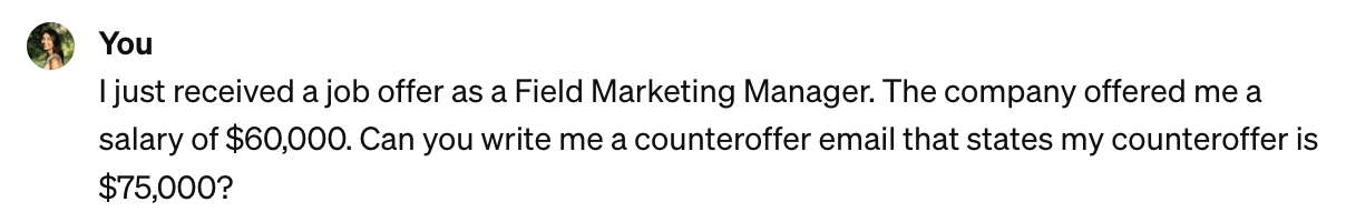
And here is the counteroffer email that it came up with:
While this email is on the longer side, it gets a lot of things right. The email begins by stating an appreciation for the job offer and an emphasis on why they’re excited to join the company.
The next section briefly touches on the candidate’s qualifications and why they’re proposing a counteroffer. The email then reiterates their enthusiasm for the opportunity and how they will contribute to the position.
If it were me, I’d remove the second to last paragraph. I don’t think it’s necessary to say, “I understand that salary negotiations are a standard part of the hiring process,” because the hiring manager is well aware of that already.
What I like: I like how the email communicates enthusiasm for the position before and after the counteroffer. In my experience, this shows that the candidate is taking this offer seriously and is eager to come to an agreement.
2. Counteroffer Email Example: Market Research
I want to see if ChatGPT can create a similar counteroffer negotiating a higher salary, but this time, I want to show that I’ve done my research.
Here’s the prompt I gave ChatGPT:
And here is the email it generated. I highlighted the main difference between this email and the last.
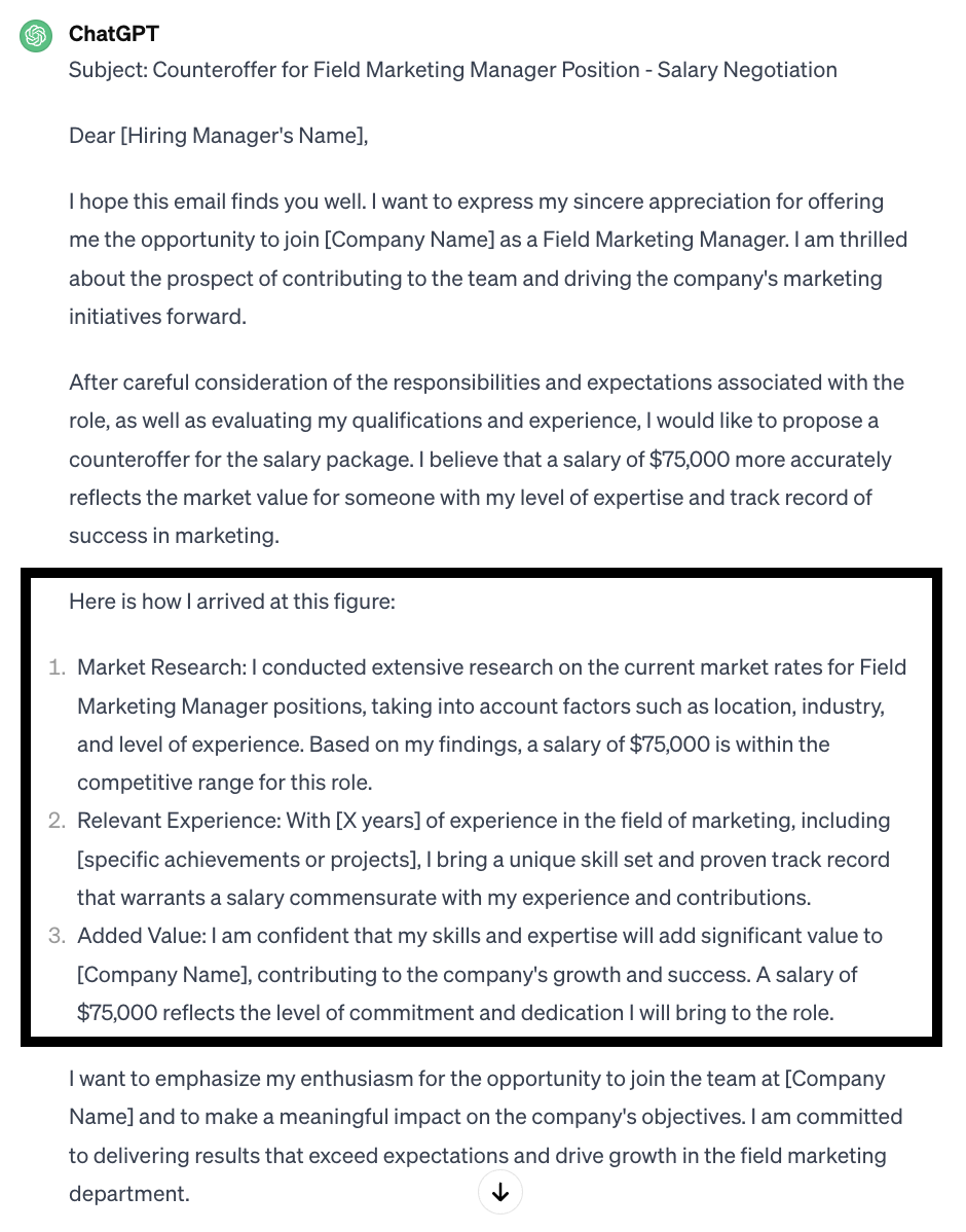
This email is similar to the script Johnston provided when she shared her tips for writing a counteroffer email. It demonstrates that a lot of research has gone into this counteroffer, and I didn’t just request a random number.
The rest of the email could stand to be edited down, but overall, I think a strong point was made.
What I like: Using a numbered list makes the email easier to scan and digest.
3. Counteroffer Email Example: Benefits Negotiation
For my next prompt, I want my counteroffer email to negotiate a different work structure. Since this is an on-site field marketing position, we can assume that the work schedule would involve a lot of travel to different franchise locations. I want my counteroffer to negotiate having one day be remote or work from home.
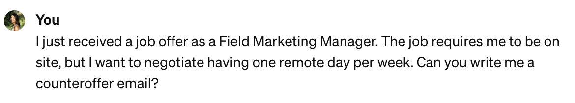
I was curious to see how ChatGPT would frame this negotiation since it’s not about money. Here’s what the chatbot came up with:
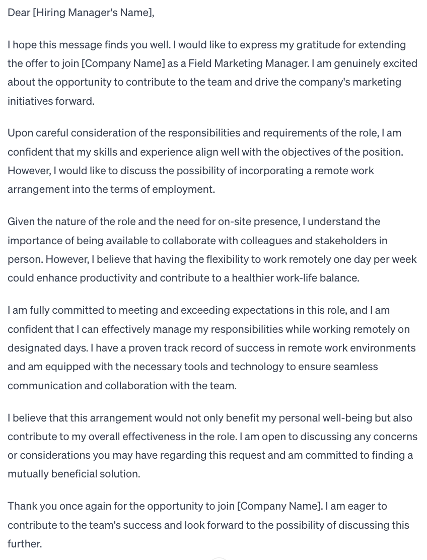
Overall, I think this is a strong counteroffer email. Not only does it communicate enthusiasm for the offer, but it provides a strong rationale for remote work.
The email thoroughly describes the situation and shows an understanding of why the role needs to be primarily onsite. But the message also includes a line about the candidate’s proven track record in remote work environments, which reassures the hiring team that there won’t be an issue with this setup.
What I like: My favorite line is, “I believe that this arrangement would not only benefit my personal well-being but also contribute to my overall effectiveness in the role.” This outlines the benefit for both the candidate and the hiring team, communicating that the candidate will perform better overall if they have a more flexible work arrangement.
4. Counteroffer Email Example: Relocation Assistance
For my next prompt, I want to send a counteroffer that negotiates relocation assistance. The Field Marketing Manager role I’m using for this example is based in Cincinnati, Ohio, and I currently live in Austin. If I got an offer, I’d need to relocate. Here’s the prompt I gave ChatGPT:

Here’s the counteroffer email ChatGPT generated:
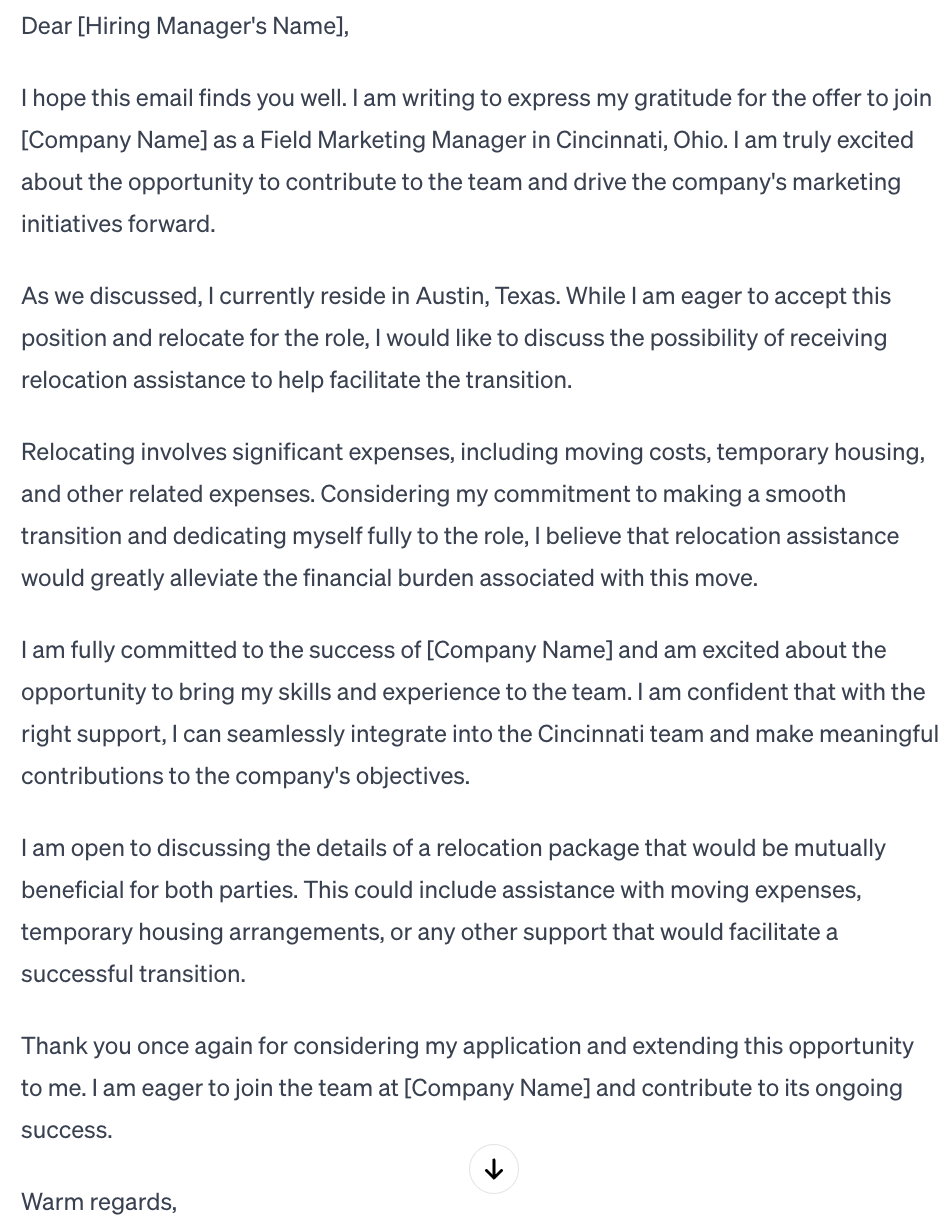
If I were this far along in the interview process, the hiring team should already be aware that I would need to relocate for the job. However, if they didn’t already include relocation assistance in my job offer package, this counteroffer email would be a strong way to negotiate.
What I like: I appreciate that the email is specific about what expenses I’d need assistance with, including moving costs and temporary housing. I also like that the email says this line to justify the counteroffer: “Considering my commitment to making a smooth transition and dedicating myself fully to the role…”
5. Counteroffer Email Example: Short Email
I noticed that all of the responses ChatGPT generated were long. I was curious what the email would look like if it were more concise, so I asked the chatbot to make it shorter. Here’s what it generated:
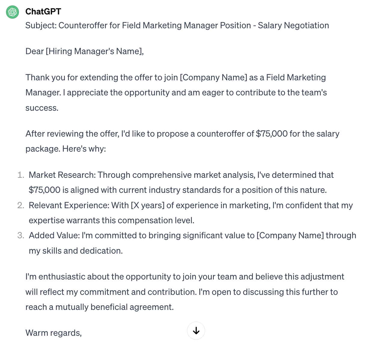
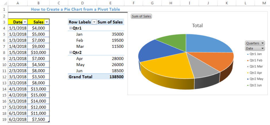
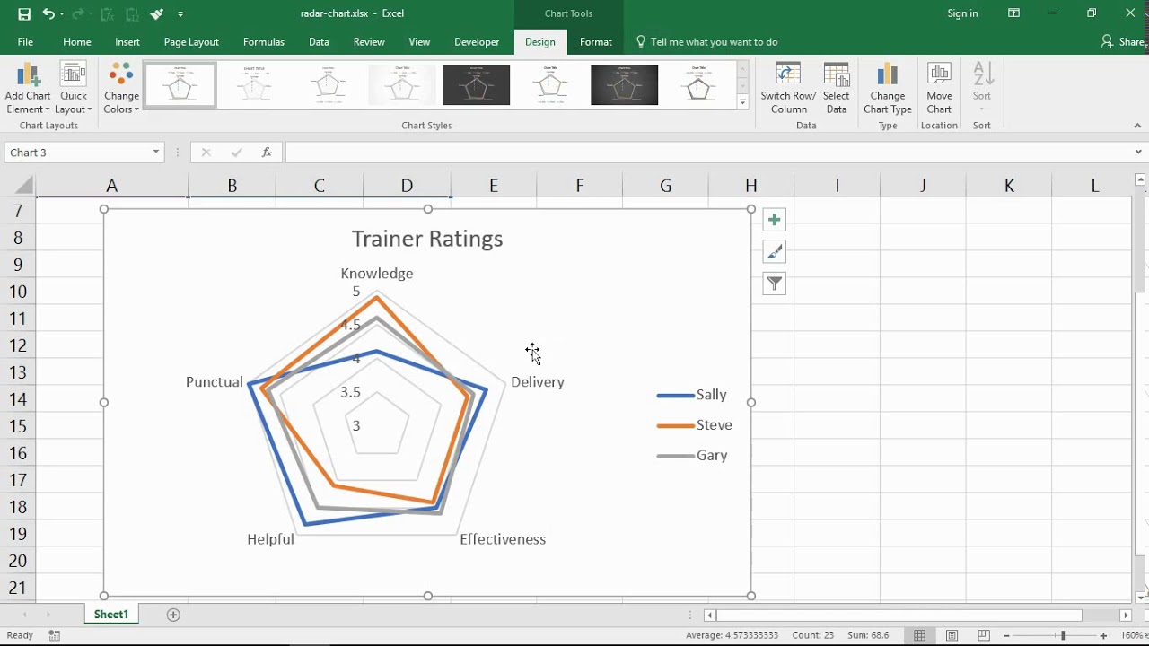
This is probably the closest to a send-ready email that ChatGPT has generated so far. It’s more straightforward and succinct while still outlining the essential parts of a counteroffer email. If I were actually about to send a counteroffer for a job, I’d be comfortable using this email (after some light editing to align with my voice).
What I like: The numbered talking points are briefer than in previous emails, but they still make a strong point and demonstrate that I’ve done my research.
What I Learned from AI
In my opinion, ChatGPT generated some pretty decent counteroffer emails. The structure and talking points of these emails aligned with the tips Johnston shared, indicating that ChatGPT is familiar with counteroffer best practices.
And, while I didn’t prompt ChatGPT to use a certain tone or style for this experiment, you can get more specific with your prompts if you want to generate a counteroffer email that aligns more with your voice.
If you want to use AI to assist in writing emails during the job search process, I’d use ChatGPT for practice rather than for your actual email to the hiring team.
You can conduct a similar exercise to the one I did by giving the chatbot multiple prompts for different negotiation scenarios. Writing and refining your prompts helps you narrow down what you’re willing to negotiate on and the terms you may be less flexible about.
Overall, AI works well for crafting a solid counteroffer email structure, but it’s up to you to conduct research, come up with a desired salary, and confidently pitch yourself.
Making Your Counteroffer
Making a counteroffer is an anticipated part of the interview process. Prepare ahead of time by practicing writing counteroffer emails. Preparing what you would negotiate in different scenarios can help you clarify your desired salary and non-negotiables and help you improve how to justify the counteroffer and communicate your value.
By practicing your script and following the expert tips above, you can write an effective counteroffer email that helps you land a job with a salary and benefits package that you’re satisfied with.
![]()